The world of healthcare marketing moves fast. If you’re not getting the results you expected from digital marketing campaigns or failing to meet industry benchmarks, your conversion rates might be the culprit. That’s the work of conversion rate optimization (CRO): to evaluate campaigns and systematically improve conversion rates on key pages. The goal? To increase conversion volume, lower cost per acquisition (CPA), and increase the lead-to-sale ratio.
What is Conversion Rate Optimization?
Conversion rate optimization (CRO) is more than just design, analytics, or landing pages. It’s about understanding human behavior and what motivates healthcare consumers. By creating ads, landing pages, and content that appeals to these motivations, you’ll be able to persuade them to take the actions you want (contact you, schedule an appointment, etc.). That is healthcare CRO in a nutshell.
Here are seven ways to start implementing CRO methodologies right now.
1. Make it Easy to Schedule an Appointment
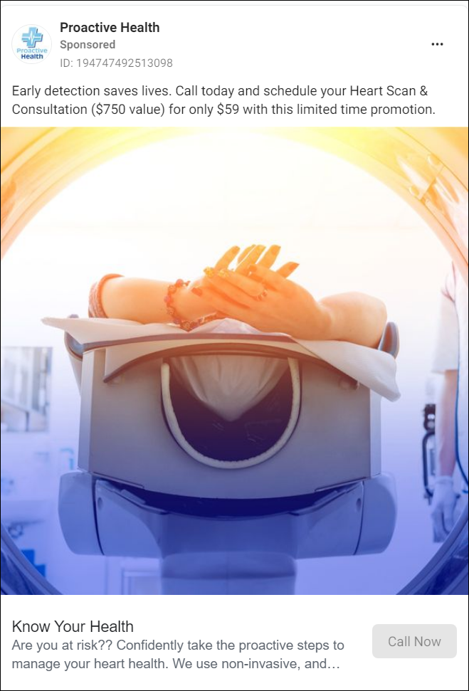
It’s a common problem in healthcare marketing: your ad is reaching the right people, but failing to convert. Why? Because it’s too difficult to schedule an appointment, which is what most high-intent targets want to do. This is a huge missed opportunity!

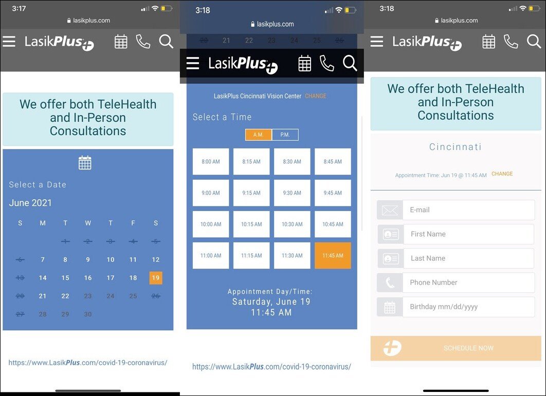
It seems like a no-brainer, but display the book-an-appointment button prominently on your ads and websites. Don’t make patients dig through multiple levels to call, fill out a form, or send an email. We recommend that you make the scheduling button and/or your phone number sticky on every webpage. All scheduling buttons should be the same color—don’t make the button red on one page and green on the next. It’s about training users to take a particular action. That is, to schedule an appointment, you click the red button.
It works.
Finally, keep your ears and eyes open to common scheduling complaints. Where does the friction arise? Have patients reported trouble reaching staff? Do they not know about your online scheduling tool? You might consider investing in call tracking software to analyze call data for complaints. You can also search your digital reviews for certain keywords to see what people are saying about your scheduling experience.
2. Provide More Than One Option to Book
So much of healthcare CRO is about understanding your patient. It’s about understanding not just what they want to do but how they want to do it. The devil is in the metrics, where you’ll find insights into who wants to click a contact button and then call in vs. who wants the convenience of online scheduling.
In the end, your ad conversion rate might be suffering because you’re making the audience conform to what you want them to do rather than giving them options. Such as:
- Call directly from an ad
- Click to call on a mobile device
- Fill out a contact form
- Send an email directly
- Dial your number
- Visit your physical office
- Contact you via social media

3. Provide the Information People Need to Decide
At a high level, patients have only a handful of needs when they reach a healthcare website. And if those needs aren’t met, user engagement—let alone a conversion—is improbable. In our recent in-depth look at How Patients Choose Healthcare Providers, we discuss these needs in detail, namely:
- Insurance information (a very common need)
- Locations (address, hours, contact info)
- Appointment availability (accurate and easily accessible)
- Services available (organized and easy to find)
- Doctors (including reviews, ratings, and video introductions)
- Reputation cues (more on this later)
Don’t make your ad audiences hunt down what they need or guess for the answers to these questions. If you do, they’ll bounce back to search and find a provider that gives them this information. Instead, make this information clear and understandable throughout each step of the journey—from ad click to landing page and beyond.
4. Optimize for Mobile
Most of our clients now have upwards of 60% of their traffic coming from mobile devices. Hundreds of thousands, if not millions, of daily internet searches are healthcare-related. Targeting this audience with ads that convert, however, is another story.
First and foremost, you need to prioritize mobile UX. That means ad messaging, creative, and corresponding landing pages that are a) fast and b) responsive. Your click-to-call functionality on your landing pages, as well as your online scheduling and forms, need to be optimized for mobile. Not sure if this applies to you? Pick up your smartphone and test a couple of ads. You’ll feel any friction in the mobile UX quickly.
READ: We’ve explored each of these mobile optimizations in greater depth in Healthcare Marketing for a Mobile-First World.

5. Use Social Proof to Your Advantage
In healthcare, reviews and other digital reputation markers are essential. People tend to choose providers based on reviews, ratings, and testimonials. So make sure to incorporate what available social proof you already have throughout your digital presence.
The landing page you create in support of a breast augmentation ad campaign, for example, might include embedded reviews specifically related to that service. Your website ought to be replete with video testimonials, too, which can be repurposed across social media. In our experience, video is the most compelling social proof, though photos and quotes are more than adequate.
READ: Learn how to integrate social proof throughout your digital presence in our article How to Get More From Your Online Reviews.
6. Clarify Your Location
Imagine you’re a healthcare consumer looking for a specific service in your geographical area. Can you imagine the frustration of being unable to locate a provider you’re interested in? You’re looking at a provider’s website, ready to book, but can’t determine their exact location. Or the ad said one location, but the landing page lists a different location. It seems simple, but far too many healthcare organizations overlook this fundamental question: do patients know where you’re located?
Make sure each of your locations is clearly listed on your website and landing pages. For each location, enumerate with no uncertainty the doctors, services, and scheduling locations available at each location. Ambiguity is your enemy here.
7. Make Text Skimmable
As much as we consider ourselves readers here at Cardinal, we get it: people just don’t want to read. They want to find the information they need quickly and efficiently. What we’re talking about is readability, an essential part of CRO.
Think about it: a healthcare consumer has a pressing need (surgery, consultation, etc.). They click an ad through to a landing page. Are they going to spend thirty minutes reading each and every word? Not likely. They’ll probably spend 30 seconds, max. To meet this strange balance of detail and skimmability, start here:
- Include rich, comprehensive detail, but do it strategically
- Break up long blocks of texts with an organized hierarchy of headers, subheads, and bullets
- Limit titles and headings to eight words or less (leaning toward less, where possible)
- Keep paragraphs tidy (three to four sentences max)
- Keep bullet points brief (a paragraph-long bullet point is just another paragraph!)
- Emphasize pull quotes, key statistics, and social proof with distinct web elements

One Last Thing: It Doesn’t Happen Overnight
We get a lot of healthcare clients asking the same questions:
- My conversion rates suck—how do I improve them?
- What are easy ways to boost conversions?
- How do I optimize my website for conversions?
Perfectly valid questions! As this blog post demonstrates, there is no overnight fix. A comprehensive CRO audit alone can take at least thirty days. But it is so worth it. For example, CRO testing for a leading behavioral health client of ours revealed some high-value insights that shortened the funnel from three clicks to one. How’d we do it? We served content dynamically based on the consumer’s location. The result? A 115% increase in CVR and a $67 decrease in CPA.

