With all the buzz around the “mobile-first” experience, you might be wondering just how important mobile optimization is in healthcare marketing. Here’s the long and short of it: better mobile websites and overall digital experiences need to be an investment priority moving forward.
It’s a must.
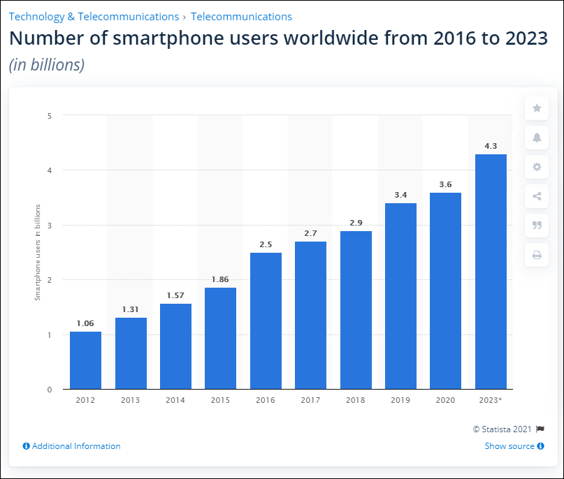
The reason is rather simple. The opportunity cost for failing to optimize for mobile across your patient journey is far too high. We know that approximately seven percent of daily internet searches are healthcare-related. And Google is estimated to receive one billion health questions every day. And while the data around mobile users is variable at best, we do know that people are spending 23 additional minutes per day on their smartphones in 2020. Statista estimates that there are more than 3 billion smartphone users worldwide.

Can you afford to overlook such a large share of your digital audience?
An All-Points Approach to Mobile Optimization
Today, consumers expect great mobile experiences as they get elsewhere online, and that demand impacts digital marketing outcomes. Do you really want to risk creating high-friction mobile experiences when a large portion of your users are likely interacting with you on their mobile devices? We don’t recommend it.
Google knows consumers want great mobile UX, for example, and favors websites that provide them. Present a bad mobile experience? Your site probably isn’t going to rank very well (bye-bye organic traffic). If your PPC landing pages aren’t optimized for mobile and users quickly bounce, your Google Ads quality score and ad rank could suffer and drive your cost-per-click (CPC) up.
In terms of optimizing for mobile, we recommend a more comprehensive approach, with attention paid to all of your core patient touchpoints. Here are tips for the most common channels patients interact with:
Your Website

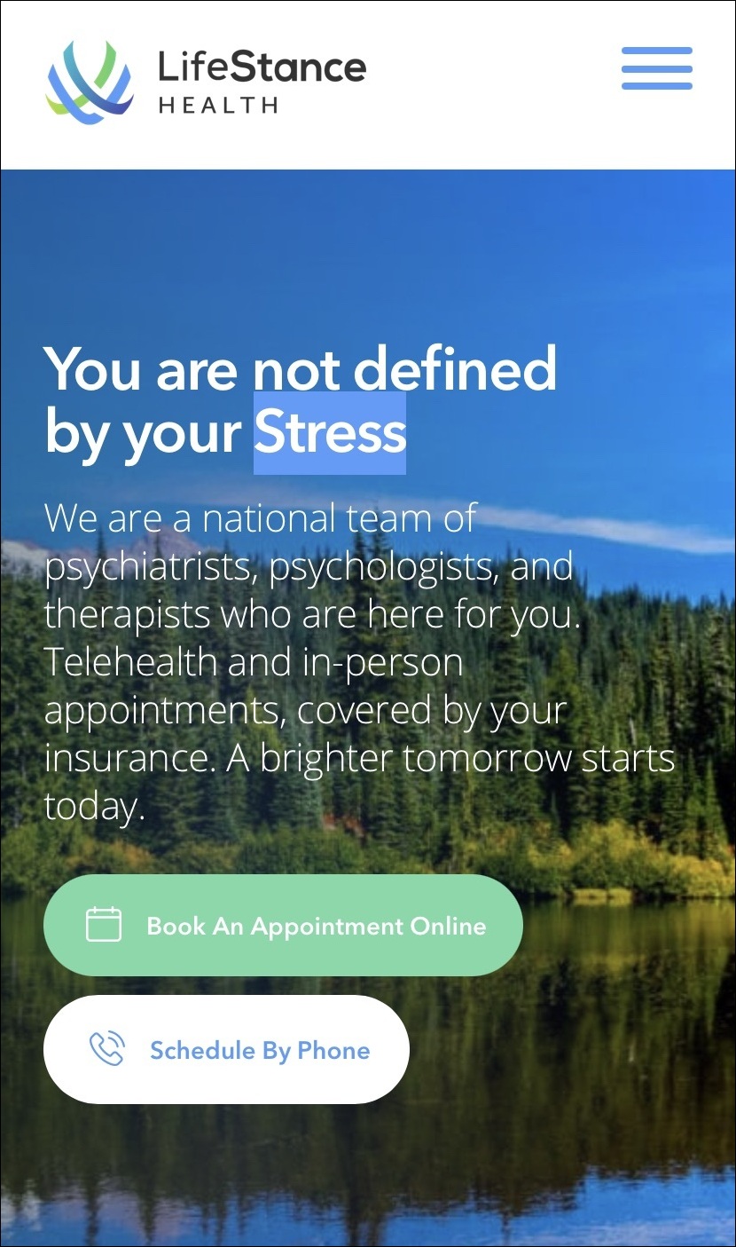
Building a responsive, mobile-friendly website can be an expensive, time-consuming, and highly technical undertaking. Let’s start with something more simple: take your site for a spin on your mobile device. Put yourself in the shoes of a patient trying to get information, solve a problem, or ease their worries. What kind of “digital front door” will they arrive at if they’re finding you on their phones?
Not only does your site need to look good on mobile devices, but it also needs to be easy to use for healthcare consumers. This is more than just a best practice: it’s a Google ranking factor. In 2018, Google announced a mobile page speed update, which introduced a new ranking algorithm for mobile search based on page speed. Since then, their focus on the mobile experience has only intensified, and the upcoming Core Web Vitals update (coming May 2021) introduces new ranking factors that center user experience.
What does that mean for you? Essentially, your site’s rankings will be directly impacted by your mobile user experience, namely. What does a great user experience look like? Here are a few things to prioritize:
- Responsive design
- Fast page speed
- No intrusive pop-ups that block the screen
- Easily accessible, mobile-optimized buttons and CTAs that quickly respond when tapped
- Ease of use when conducting research (finding information), scheduling online, calling, and finding directions
Think about common paths that website visitors follow and test them on mobile. If you want new website visitors from organic search to first check out your COVID-19 updates, how well-optimized is that experience for mobile? How about when they try to look up a common procedure that you offer?
Ads
In the world of healthcare ad spend, it’s all about return on investment (ROI). In our work with healthcare organizations, we’ve seen a considerable opportunity for more effective, cost-efficient ad campaigns through mobile optimization. Indeed, optimizing text, images, CTAs, and other elements of your PPC ads can be the difference between percentage points on CTR, ROAS, and other metrics.

Essential to this effort is a deep understanding of context. How and when—and on what device—are people viewing your ads on mobile? What else are your ads competing with in terms of attention and screen real estate? And what actions is your target audience likely to take from a mobile device (click through, call, fill out a form, and so on)?
As you take a look at your ads from the perspective of mobile optimization, here are a few things to consider:
- Think about what people are doing on their mobile devices. What kind of healthcare information are they seeking within your space? If they’re not seeking healthcare info at that moment, what else might they be doing that you can leverage in your creative? How can you capture their attention?
- Know the different strategies available to you for different channels. Ad types and mobile optimization options differ, or go by different names, on Facebook Ads vs. Google Ads.
- For Facebook Ads, build content based on what mobile users want. Your metrics might reveal that your mobile ad audiences prefer quick tips or rich infographics versus blog posts or longer, authoritative reports. Instead of text-based content, maybe video is a better way to engage them.
- Adhere to mobile ad best practices, namely large font sizes, proper formatting, bold design, and strong CTAs. For video ads, make sure your outputs are optimized for mobile, too.
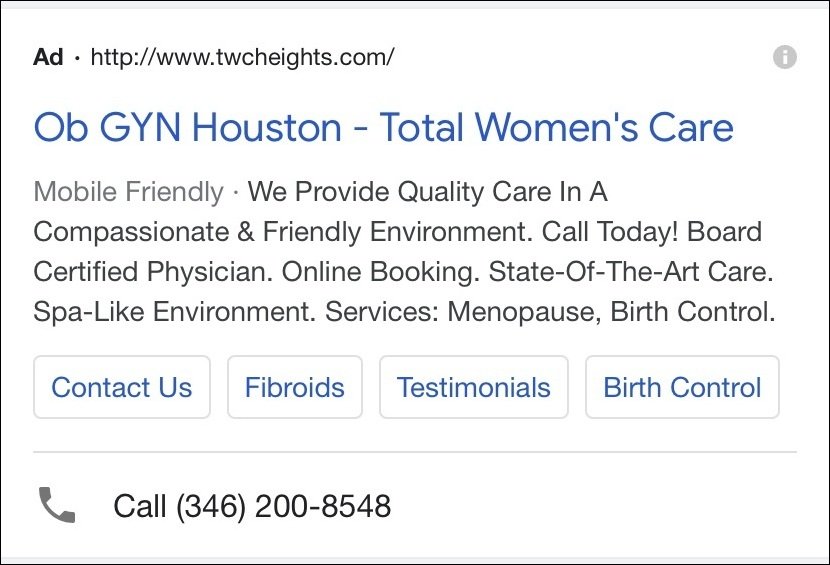
- For Google Ads, focus your efforts on “high-intent” audiences—people who are ready to book an appointment for a particular service, for example. You can use ad extensions to help them complete a task (call, sitelink, location, and so on), or even try mobile-only ads.
Landing Pages
Like the ads that point to them, the success of a given landing page will depend in part on its mobile experience. Beyond developing unique landing pages for each ad campaign—something we absolutely recommend—make sure your landing pages seamlessly move consumers from the ad to the action you want them to take (click, call, schedule, etc.).
As to the how of mobile landing page optimization, the guidelines are very similar to the web best practices listed above. With one caveat: make sure each landing page has all of the information consumers need to make a decision, including persuasive copy, testimonials, service overviews, and a scheduling button or click-to-call option. Again, all of these elements ought to be designed and tested for mobile devices.
For more information about optimization ad campaigns and landing pages, please see the following resources:
Apps and Online Portals
More and healthcare organizations are launching apps and online portals and for good reason. These portals can make life a lot easier for both patients and their physicians, including the ability to send messages, access health information and test results, or even schedule appointments.
However, the convenience of an app or online portal can quickly turn into frustration if the platform isn’t easy to use. First and foremost, we’re recommending that healthcare organizations invest resources toward educating and onboarding patients onto apps and portals. This might include written or video instructions, tutorials, etc.
Make sure to invest in a good, mobile-optimized user experience (UX) and user interface (UI), too. Nothing is more frustrating than trying to view test results or view a new message from your physician, being unable to find what you need.
Best practices include buttons and actions that are easily discoverable (not hidden in menus) and testing. Thoroughly test your mobile UX—don’t let the team launch without getting real users involved and incorporating their feedback! Always—ALWAYS—ensure that your patients’ data and privacy is secure.
Scheduling Platforms

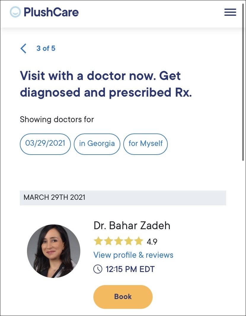
As with apps and portals, many healthcare organizations are bringing in third-party or bespoke scheduling platforms to handle that part of the patient experience. For myriad reasons, from privacy to convenience and generational preference, lots of people would rather quickly schedule their next appointment without calling, using their mobile phone.
That said, here are a few mobile best practices to follow for your scheduling platform:
- Insist on selecting a vendor that prioritizes the mobile scheduling experience, including how it integrates with the rest of your mobile web experience and channels
- Optimize the calendar, time, and date experience for mobile (this is such a common sticking point)
- Make it easy to select different locations, doctors, and so on
- Where possible, try to incorporate mobile-friendly features such as adding an appointment to the calendar app, or opting in for SMS reminders
Not only will these mobile optimizations make life easier for your patients; but we’ve found that a mobile-optimized scheduling platform can help increase adoption while cutting down unnecessary, time-consuming phone calls that tend to tie up staff and increase wait times.
Keep Pace with Mobile, As Patient Experience Depends on It
We’ve said it before and we’ll say it again: it’s not enough just to have a website. Larger healthcare organizations that think they can swing it on the strength of their brand alone might soon be feeling the cost of poor mobile experiences more acutely than ever before.
The fact is, mobile devices and mobile-optimized experiences are so common now that a good mobile experience has become an expectation. Healthcare consumers demand it. According to Google, “79% of people say they’re more likely to revisit and/or share a mobile site if it is easy to use.” And that’s just the tip of the iceberg. So, wherever you are in terms of digital maturity, you should strongly consider investing time and effort into better mobile experiences across all of the channels we touched on above.

