As a consumer, there’s nothing more frustrating than wanting to patronize a business but being prevented from doing so. You’re upgrading your phone online, and the cart experience turns into a Rubik’s cube. Or the page times out with a “There’s been a problem” error after you try to purchase concert tickets online. Even finding contact information can be challenging on some websites. If it’s me in those situations, my next step is to bail—I move onto another vendor, or I abandon the purchase decision altogether.
The same goes for healthcare consumers seeking dental care. Especially for so-called “low-acuity” care, such as cleanings, cavity fillings, and teeth whitening, people don’t spend a lot of time considering the decision. They hit the marketing funnel with a head full of steam when they need care—they’re ready to do a Google search, evaluate what they find, and choose quickly.
Any friction they meet along that journey is an opportunity for them to choose another dental practice. And friction might be the reason your dental support organization (DSO) campaigns aren’t converting into appointments. That’s what makes optimizing your digital experience such a critical part of any DSO marketing strategy.
What DSOs Should Know About UX and CRO
In short, a good user digital experience can help you get more from every marketing dollar, get more from your investments, and consistently fill your patient pipeline. After you develop a frictionless user experience, something DSOs should also consider is conversion rate optimization (CRO). It’s the next step in refining your UX, motivating users to take action, and ensuring you get the most out of every visitor.
Typically, CRO accomplishes two critical things:
- Ensures that you guide website visitors to the action you want them to take
- Increases conversions, lowers CPAs, and increases the lead-to-sale ratio
Yes, conversion rate optimization (CRO) has to do with making life easier for healthcare consumers through things like web design, analytics, and landing pages. It’s also about taking a patient-first approach to your entire marketing strategy. What do patients need at a particular point in the funnel? What are their expectations in terms of time and effort?
Traditionally, people think of CRO in relation to paid media campaigns, where you’ll likely tinker with ad creative, format, and landing pages to increase conversions. But CRO extends to your organic marketing efforts, too. If you know, for instance, that 30 percent of your organic web traffic comes from a single website page, but only 1 percent of traffic to that page converts to an appointment, you might need to update that page against CRO best practices.
Now, let’s take a look at how to develop a strong UX and the ways you can improve conversion rates.
5 Tips to Improve Your DSO’s Digital Experience
While improving your UX can get quite data-driven, even technical, most tactics stem from a simple question: what barriers are preventing patients from taking action—from scheduling an appointment, contacting a member practice, or booking a surgery? Among DSOs, here are five areas to focus on first.
1. Make Appointment Scheduling a Breeze
I recently worked with a dental practice on some paid display ads that weren’t converting. To be honest, the creative itself was very good (a first-appointment special targeting new patients). The problem wasn’t keyword strategy or audience targeting, either. The problem was the scheduling experience: once the person clicked through to the website, it was janky. It wasn’t optimized for mobile.
I know because I tested it myself. Right away, I knew the problem, the same one I see all the time: an ad that reaches the right people but makes it too difficult to schedule an appointment. To avoid this disjointed experience, try to:
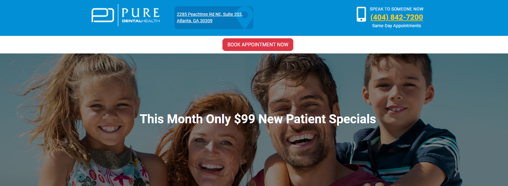
Display the book-an-appointment button prominently!
Don’t make patients dig through multiple levels. Depending on the ad, you might be able to add a click-to-call option directly from the ad (with no need to click through to a website). In addition, the button and/or your phone number should be sticky on every page. If a user is scrolling down a page to learn about your services, don’t make them go back to the top! A sticky call-to-action banner helps them take action as soon as they’re ready.

Another tip: Make all CTA buttons the same color so as to train users to associate that colored button with making an appointment.
The messaging on these banners is often a good candidate for CRO testing.
Pay attention to complaints related to scheduling
Have patients reported trouble reaching your staff? Do they not know about your online scheduling tool? You can invest in call tracking software to analyze call data for complaints or monitor reviews for keywords related to scheduling. If there’s something broken with your appointment scheduling, people will tell you.
Understand your patient base
Provide the scheduling options they want, not just the ones that make the most sense for your business. Some patients might prefer submitting a form to schedule an appointment. Others want to pick up the phone. Then there’s online scheduling, too. The point is, don’t make people conform, as it only tends to increase friction.
2. Provide the Info People Need to Choose a Dental Provider
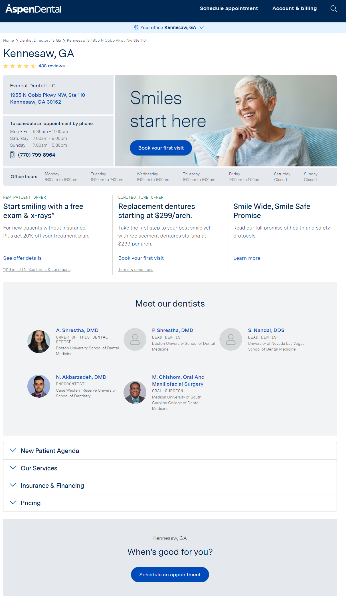
People looking for a dentist need a few fundamental pieces of information to make their decision on the spot. In our recent in-depth look at How Patients Choose Healthcare Providers, we discuss these needs in detail, namely:
- Do they accept my insurance?
- Are they located nearby?
- What are their hours and how do I contact them?
- Are they accepting new patients?
- Do they provide the services I’m looking for?
- Do they have good online reviews and ratings?
- Can I contact them using my preferred method?
This crucial information is simple in theory, but it ought to permeate the entire patient acquisition funnel, from the first to last touch. People who have to dig for info, or who don’t get what they need in a click or two, tend to bounce to another provider.

3. Make Your Location Plain as Day
Speaking of the necessary information, do your prospective patients even know where you’re located? This is a particularly useful tip for DSOs, who tend to have many member locations and dentists. Remember: there’s a lot of ways to arrive at your landing page, and your location isn’t self-evident to new visitors. You can do wonders for conversion rates just by making sure that visitors know and can book with the location closest to them.

It seems simple, but it is less straightforward for multi-location practices. To communicate the dentists and services at each location, as well as the ability to schedule at each location, you’ll probably need to revisit your DSO website strategy. You might need to audit the landing pages in each campaign to make sure that the location’s info is well communicated. And your local SEO strategy might need revisiting to make sure “dentist near me” searches are returning the best Google My Business listings and relevant location pages for those geographical searches.
4. Optimize Everything for Mobile
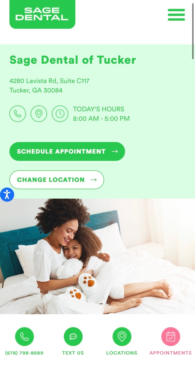
Most of our own DSO clients now have upwards of 60 percent of their traffic coming from mobile devices. You’re not going to convert this traffic into patient acquisition if you don’t optimize for mobile across the board.

When optimizing for mobile, be comprehensive, with close attention to the following areas:
- Website user experience (UX) and responsive design
- Page load speeds
- Mobile-ready ad creative
- Online scheduling, forms, and CTAs
The best way to identify opportunities for mobile optimization is to test things yourself. Pick up your smartphone and test a couple of ad journeys from start to finish. I suspect you’ll feel the friction for mobile users right away. For more on mobile optimization, read Healthcare Marketing for a Mobile-First World.
5. Give People the Option to Skim
Take a stroll through the Cardinal Digital Marketing blog. While there’s always room for improvement, we do our best to make our material skimmable. People don’t always want to read long, in-depth information (though we provide that too). Often, they want to find the info they need ASAP—they want to skim headers, check bullet points, scroll quickly, and make a decision.
To create that kind of experience, here are a few best practices:
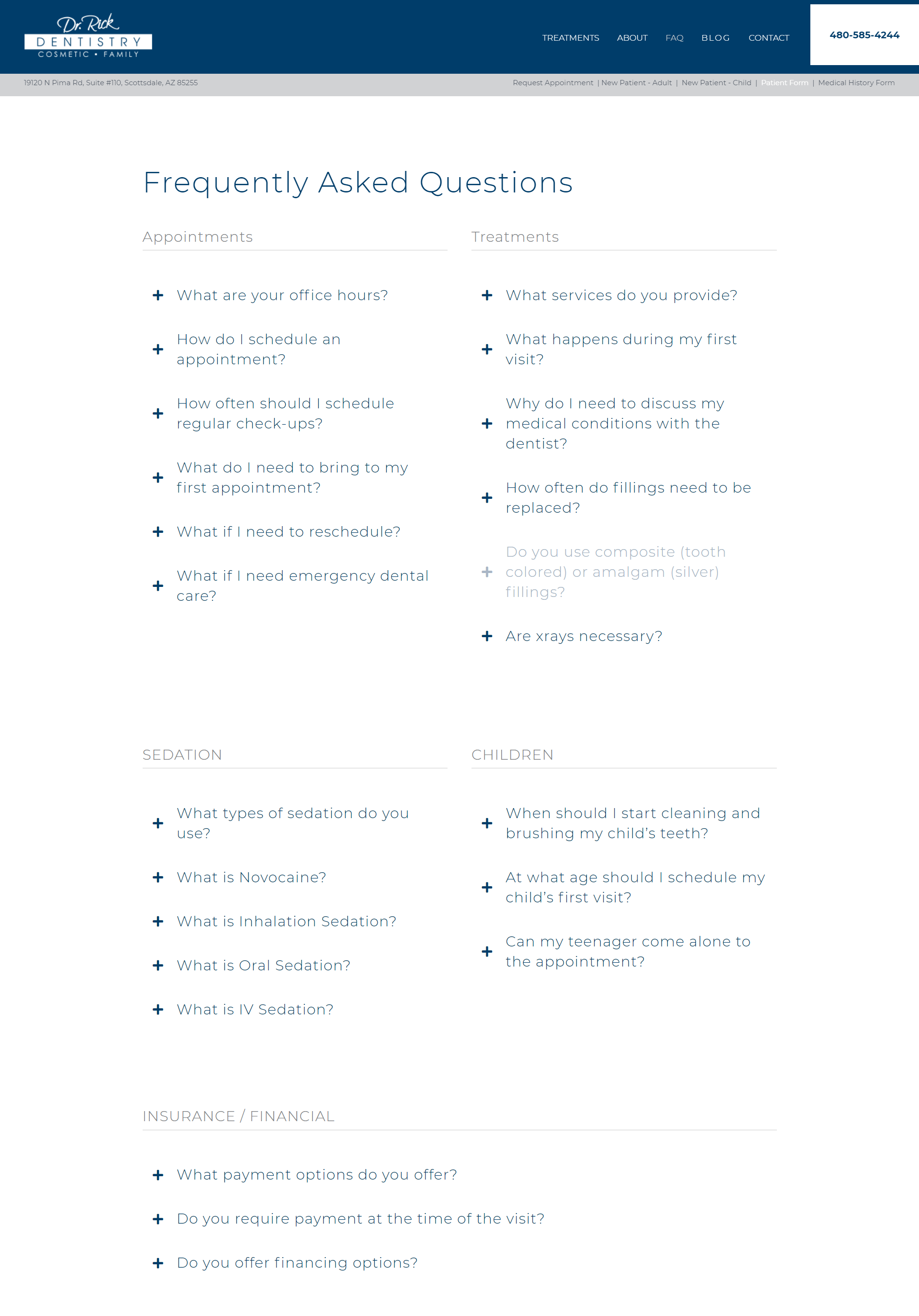
- Break up text blocks using headers, subheads, and bullets
- Communicate the most important things in headlines (succinctly)
- Incorporate images, video, and audio
- Weave in pull quotes and insets
- Use summaries and tables of content so people can jump around easily
- Always create value—if adding length doesn’t add value to the reader, cut it
Finally, Understand the Opportunity Cost
Have you ever slept on an air mattress that’s slowly losing air? It might start off well enough, but by morning, you’re curled up on the hard floor. Over time, a leaky, inadequately optimized digital marketing strategy can seriously crater your goals for patient acquisition.
Some of the best practices we’ve laid out above can be handled by a capable in-house marketing team. Heck, you don’t need much expertise to test experiences and note any points of friction. For more complicated, full-funnel UX and CRO, there are specialists out there—both agencies and individuals—who specialize in the dental industry.
Whichever route you go, I do recommend some urgency, as your next patient might have found you, considered you, and moved on without you even knowing. And this might be happening every day.

