According to recent research, it’s been found that 90% of the information that the human brain processes is visual. What’s even more amazing is that humans process pictures 60,000 times faster than written text.
That’s crazy!
Right now, you may think that your brain is processing this text that you’re reading, but a single image like the one below will boost your ability to recall the text easier:

Research also shows that 65% of humans learn through visuals. Now, let’s think about this. If you’re a content creator, you can use this to your advantage.
As a content marketer, I’m sure that you’re constantly experimenting and testing new methods to engage your website visitors. If certain marketing tactics and experiments failed, you may want to revisit them again. Most likely, they didn’t work because you didn’t include visual elements.
However, you may have used visuals but still didn’t achieve much success with a particular blog post. Maybe you used the wrong visuals or placed them in the wrong location within your posts.
That’s okay, you can always go back and make little corrections. Whether you want to revise what you did or start improving your blog posts going forward, here are 8 visual elements that you can implement into your blog posts to boost up your rankings:
1. Images
Have you ever looked at an old photograph and suddenly experienced a rush of the exact emotion that you had when the picture was taken? That’s the power of images; they have the ability to reach people in ways that plain text just can’t.
As a matter of fact, studies have shown that posts with images pull in 94% more visits than the ones that just have plain text.
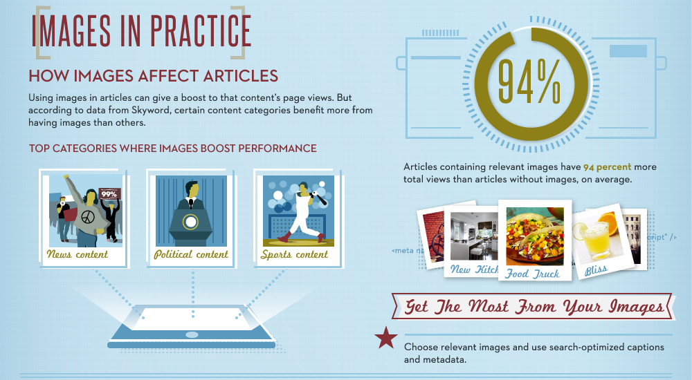
Isn’t that a fascinating stat? It simply means you can pull in 94% more traffic to your blog posts by simple integrating images into them. Plus, images are an excellent way to make your posts easier to read because it breaks it up into easily digestible parts. Readers don’t read posts line by line; they tend to simply glance through them. And if they encounter huge blocks of text, they’ll most likely not retain the information you’re trying to communicate and you’ll lose their engagement as well.
This is the reason why an increasing number of bloggers have begun inserting more images in their posts… images give your content retention power as readers stop while scrolling to relate the text to the pictures.
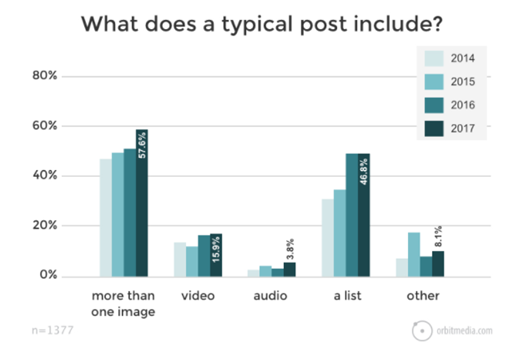
As the bar graph shows, the human brain works in such a way to retain and process visual information. So, by using images, your point comes across even if your text isn’t read word by word.
Now, keep in mind that when you’re trying to improve your off-site SEO, using images is also extremely helpful. Imagine sharing a post on social media without an image…you’d have extremely low engagement since social media thrives on visual imagery. When you publish your blog post on the web, make sure that images are a part of it.
2. Unique Photos
You’ve probably been thinking, where do I get images from? Well, in today’s cyber world, the web is rife with photos and many of them are available to you to help boost your content. There are free photography websites like Pexels and Unsplash.
It’s very important to adhere to copyright laws and give the original owner of the photo credit when you do. Make sure you read any disclaimers and credit people if they require it.
However, there are other ways to include visual content without using someone else’s photos. For instance, if your aim is to take your content marketing to a new level, use unique, original photos. You should do this for a variety of reasons. First, it ensures that your content or posts are authentic, and it eliminates the situation in which your audience may have seen the image before.
True, if it’s the photo of a popular place or thing, there are probably other pictures of it out there; however, you’ll still maintain the originality of yours. Plus, you won’t have to worry about giving image credits to anyone.
Using unique photos broaden the usability of your images and you can even add them to your social media posts.
For example, take a look at a Muscle Milk Instagram post:

These are pictures of hikers using Muscle Milk or embodying the lifestyle of their users. They could have curated random photos of hikers from the web and posted them, but they didn’t because it wouldn’t have been as unique as this one.
Social media platforms are one of the best places to use unique photos and thoughtful captions. By sharing engaging content, you’ll motivate people to follow your brand. Once you have their interest, it’s much easier to launch campaigns and promote products.
If your readers discover you’re using random photographs from the web, you’ll lose their trust and interest. But if your photos are unique, people will want to share your post or use your photo via credits on their own posts. As a result, you’ll get more traffic which will help boost your search engine rankings.
3. GIFs
Graphics Interchange Format (GIF) is basically a moving picture that’s more descriptive than a photo but shorter than a video.
For instance, when you place a video in your blog post, you have to hope that readers will click on it to see the message. However, GIFs load faster and immediately activate when it appears on a viewer’s screen.
GIFs are great to use when you want to elaborate on an action the user needs to take or show something visually that you’re trying to explain. However, they can be used for multiple purposes. If you want to give your readers a breather and add a funny visual in between text, GIFs are an excellent way to do that.
This allows you to keep the attention of your readers and boost engagement with your posts, ultimately increasing user satisfaction.
4. Relevant Memes
The internet is currently under some sort of meme invasion; it seems like these things are everywhere. Especially if you’re on social media (Twitter, Facebook, and Instagram) a lot, it is almost impossible to not see one every day.
Most times, the goal of using a meme is to pass along a funny message. However, sometimes they’re just out of place and ridiculous. Nevertheless, they can still be used to enhance your blog posts when relevant and entertaining to your audience. To the right is an example of a meme that you could use if you’re writing a post on content creation.

Basically, a meme is simply an image with text written right on it in big block letters. However, in order to be effective with them, you need to come up with creative ways to transform a well-known image, actor, celeb, cartoon, or picture into something that aligns with your post or brand.
Keep in mind though that when surfing the web for memes, you’ll find that many include vulgar or rude messages written across the picture. It’s best not to use these for professional use as this could totally turn off your audience. To ensure your posts have broad applicability, use only memes that portray a corny message that’s not outright rude or “too funny”.
Furthermore, if you don’t find what you’re looking for, you can use online tools like the Imgflip Meme Generator to make your own unique meme.
Also, make sure you aim at your target audience. For example, if most of your readers are adults above 50, it’d make zero sense to use a teen pop icon as a meme. Your readers would be clueless as to what exactly the meme is trying to portray.
5. Embedded Slideshows
Slideshows shouldn’t just be relegated for college presentations. You can repurpose content, like a long blog article or whitepaper, and turn it into a slideshow.
Slideshows are excellent communication tools and easy to create when using SlideShare.
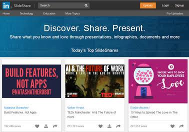
All you need to do is simplify your long posts and your readers will be able to retain the information better through this method. You can keep all of your text but breaking it up and including images will help your audience retain the information that you’re trying to convey. This is one of the best ways to renew old blog posts through visual elements.
6. Videos
As people become used to video sharing, implementing video into your digital content strategy is a must. It’s to the point where this is what your web visitors are yearning for and you shouldn’t deprive them of it, so it’s worth figuring out a way to integrate videos into your content.
Here are various kinds of videos you can make and how to use them:
- Embedded videos
- Social media videos shared alongside content
- Video tutorials to further expand the meaning of text
- Product demonstrations along with product reviews
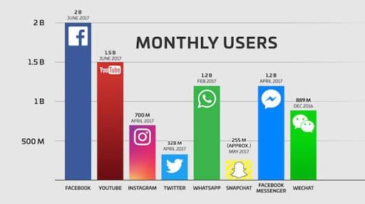
Now, it may interest you to know that by 2021 videos will make up to 82% of internet traffic. If you don’t already create videos, it’s easy to get started by creating a YouTube account. You can post your videos to YouTube and embed a link in the description that directs people back to your website.
The more your video gets viewed, the more web traffic you’ll gain. It’s also worth noting that as of June 2017, YouTube had over 1.5 billion monthly active users and it’s continuing to grow. With video, you’ll literally have instant access to a much larger number of web visitors that are ready to engage with your brand and navigate over to your website.
7. Whiteboard Presentations
At one point or another, you may have come across a whiteboard presentation while surfing the net. It’s basically a hybrid of a normal video mixed with a slideshow presentation.
However, instead of displaying your content one slide after the other, it shows as a video. And most times, it’s a video of handwritten stuff on a whiteboard, just like if you were in a business meeting with a presenter at the helm. To create your own whiteboard video presentations, we recommend using Animaker.

If your blog niche is one that requires tutorials, then this approach can work well.
8. Screenshots
Screenshots are a must-have visual for bloggers as they can make it easier to explain complex topics, especially instructional content. For things like a tech advisory blog that teaches users how to do certain things online, then sharing screenshots are an absolute necessity.
Of course, you’re going to need written text to complement the screenshot; the screenshots simply elaborate what the reader needs to do. There are a lot of software tools online that can be used for screenshots; however, one of the best is Skitch. If you’ve ever come across those pink pointers and squares or circles on images in a blog post, it’s likely that they are generated from Skitch.
Simply stating to your readers “this is where you click” isn’t enough. Drawing a circle on the specific location in a screenshot helps to clarify the instructions you’re trying to convey.
Take a look at the example below… here the screenshot clearly informs the user on what to do by using the pink arrow marks and circles. This alone improves the user experience on your site:

Conclusion
Visual elements are a lot more effective than simply using plain text. If you want to see your blog posts rank higher, then consider incorporating these 8 visual elements into your content marketing strategy.
High-quality photography and imagery can help you tell a story and engage and delight readers. Be sure to use unique imagery that resonates with your target audience and reinforces your brand identity. You should also consider incorporating new content forms like GIFs and memes to make your brand memorable.
The uses of visual elements are endless; you can take boring plain text and turn it into something memorable. If there’s one takeaway that you get from this article, it’s that visuals are powerful tools that increase user experience and engagement.
If you need help refining your content marketing strategy, reach out to us. We can help you develop a strategy that engages your customers and gets you better search engine rankings.

