Who are you optimizing your business for? Google or your customers?
It’s no news that search engine optimization (SEO) is crucial to the success of your business online. But the truth is, user experience is an important digital marketing trend. It has become a huge part of SEO—your prospect’s interest, happiness, feelings, satisfaction, etc. have become a major part of Google’s algorithm for ranking web pages. One reason this is the future of SEO is that it can’t be manipulated.
No wonder 84% of companies expect to increase their focus on customer experience measurements and metrics.

Every algorithm released by Google is aimed at giving your customers the best information when they are using the search engine. Google is actually paying attention to your business far more than you think. The reason is if they rank websites with poor UX, their users will switch to other search engines.
Heard of “landing page experience?” That has been a key factor in ranking ads in AdWords.
Landing page experience refers to how good we think someone’s experience will be when they get to your landing page. – Google
But make no mistakes, it’s far beyond just an AdWords ranking factor. In the rest of this article, you’ll discover 7 reasons why user experience (UX) is the new SEO ranking formula to watch.
1. UX is for your customer, not search engine
The purpose of ranking your website is to generate customers and increase revenue, right?
You could generate thousands or even millions of traffic, but if your user experience is poor, you’ll record an increased bounce rate and low conversions. That means you’re wasting your advertising dollars (in the case of Google AdWords or Facebook Ads) and your precious time and hard work (in the case of organic search).
Search engines are not going to pay you for appearing on the first page of Google search engine results pages (SERPs), humans will. So it makes sense that you don’t optimize your website, primarily, with your audience in mind.
We had this in mind when we created our landing page, trying to stand out among other Atlanta SEO companies. And of course, making your content easier for your audience (searchers) to find it in the organic listings pages. Because, of course, it’s a user’s reaction/behavior on your web page that Google uses to gauge how happy the user is. If they spend more time on your website, it’s a sign that they are happy. But if they bounce off quickly, then they are probably dissatisfied with your content. And, in turn, Google will push your rankings down.
If you’ve got a slow website, for example, more of your visitors will move to your competitors if it takes a long time for them to land on your page.
The best part is that by optimizing your website for humans, you’ll automatically optimize for search engines.
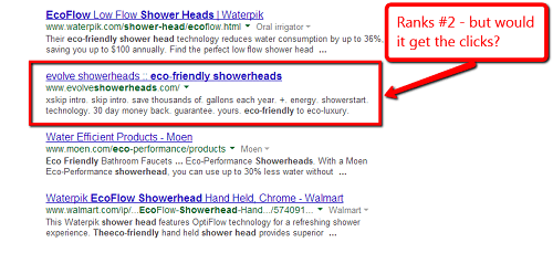
For example, stuffing your meta description with keywords that don’t make sense and making it unnecessarily long might get you on the first page but will it get you the clicks?
Like the example above, the page in the second position has a badly written meta description and yet it ranks. But think about the last time you search for something on Google.
When the results came up, did you immediately click on the first or second result? If you’re like me and several others, you’ll read through the description first to know if it makes sense and if you’ll find the answers to your questions when you click. Right?
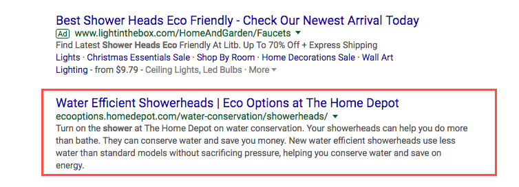
Compare the screenshot above with this. If you saw them which one will you click first? This one is already giving you value before you click. You’ll likely click on this one to get more information.
Main Street Host shared a case study where Jim Medley lacked visibility in a saturated and competitive market in the Houston, TX area, and needed help turning visitors on his website into clients on a more consistent basis. He had decent monthly traffic. He’s done a lot of SEO for restaurants.
But unfortunately, that was how good that could be. But after optimizing his website’s user experience (UX), he recorded a 66% boost in conversion and his web page started moving up in the search engine result pages.
2. Visitors want a beautiful and well-structured page layout
How do you feel when you visit an eCommerce website and it looks like it was built in 1988?
And of course, not just that it looked that way, you couldn’t find the contact details because it was hidden, you couldn’t find images or videos to make things clear to you or to have a visualization of what you intend to buy.
For example, just take a look at this car hiring website. This is absolutely horrible!
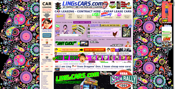
Personally, I’ll leave if I ever come across any website like this. Most people will do the same.
To make your website interesting for visitors, you should strive to help visitors take the first step, avoid information overload, and lead the way for your customers.
Yes, let your web page have one goal. Do you want your customers to subscribe after reading your content or to buy your product? Whatever, you want them to do, focus on that. Nothing more, nothing less.
How will you provide the beautiful design they need? To start with, you should answer the following questions:
- Is the page content visually attractive?
- Is the layout distracting from the content?
- Is the text pleasant to read (font size, spacing)?
- Is the text easy to scan? Thanks to paragraph headers.
- Are visitors encouraged to click through (call-to-action, links to other pages)?
Using visual content is absolutely important. A recent study shows that blogs that integrate video attract 300% more inbound links. So by creating visually appealing content, you’ll not only make your content enjoyable, you’ll also attract links from other websites and will, of course, add up to your SEO success and boost your revenue.

Some websites have their layouts distracting the content. Your website visitors just landed on your page to read a particular piece of content that will add value to them and immediately they landed, you already started bombarding them with popups, unnecessary links, design gradients, complex forms, etc.
Keep it simple and allow them to focus on consuming the content. Yes, you can introduce your popups when they are almost getting to the end of the content or are at the end already. Have you wondered why your visitors are focusing more on what doesn’t add up to your conversion?
It’s basically because of distractions. Less is more.
If you land on this website what will you do?
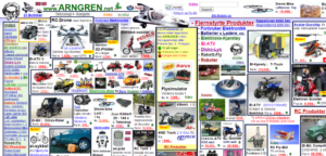
Bounce, bounce, bounce. I guess you shouted that aloud. This is another horrible example. Compare to this example from Unbounce’s page below. If this ranks, your visitors will take only one action — sign up.
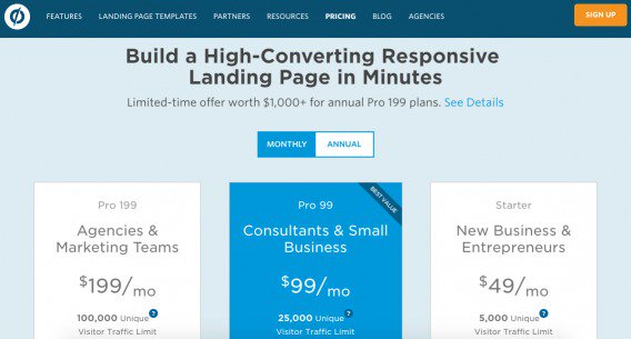
According to Chris Goward, of WiderFunnel “You see, our brains are like computer CPUs. We may think we’re smart but we have limited processing power and any ‘application’ we run can use it up and reduce our ability to process other applications (e.g. other streams of information).”
Your prospects arrive on your website with pre-existing thoughts, concerns, feelings, questions, and external influences. They are trying to understand what you’re telling them — but their attention span is stretched.
Then, they arrive on your landing page. Every design element, graphics, product options, copy block, unanswered questions, misalignments, etc. gives them one more thought to allocate their limited capacity to.
More so, your text should be pleasant to read, both the font style and paragraph spacing of your content must be appealing to the end-user. Don’t post a cluster of text. Take a quick look at this:
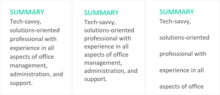
At a glance. which of the above summary is easy to read? Visitors don’t have a lot of time, make your content easy to scan by using easy-to-read fonts and adding white space to your content. Finally, encourage them to take an action.
Why did you create the particular content you created?
You want them to download a content upgrade, encourage them to do so. For example, in every HubSpot’s blog content, you definitely find a call to action at the bottom. For example, you’ll see this after reading an article about customer service.

4. Easy to use, navigate, and understand
How easy or complex is your website to use?
Do you have a complicated navigation menu?
Is your website content making it easy for your visitors to know what you’re offering within seconds of landing on your website?
The truth is, they all add up to making your visitors stay longer on your website and eventually convert.
In fact, in a recent study by Harvard, the University of Maryland, and the University of Colorado, researchers found that the more visually complex a website is, the lower its visual appeal.

Don’t go overboard with your website design. Don’t make your website so complex your visitors will need a guide to be able to use it effectively. Make it easy to use.
While it looks as though designing your website such that it’s easy to use, navigate, and understand or designing based on user experience generally is different from an effective SEO strategy that delivers results, combining them has a huge impact.
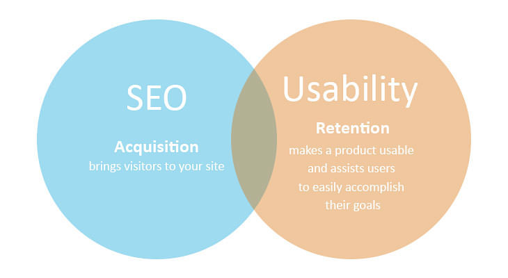
If you really want to have a successful SEO campaign, the importance of designing your website to support your users can’t be over-emphasized.
Google goes the extra mile to release an update for the mobile user experience. As they announced earlier in 2010 to become a mobile-first company. Since consumers are using mobile devices to search for stuff more, it makes sense that you give them the best experience.
Most websites are designed for desktop devices. Accessing them via mobile devices will break things. The whole user interface (UI) will be ugly. For example, take a look at the image below:
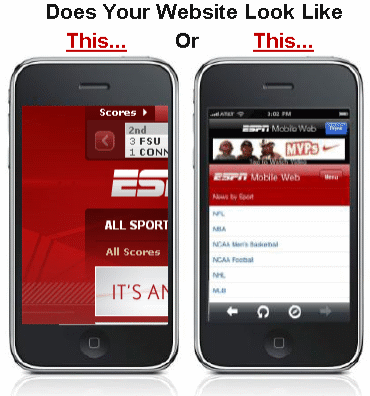
The first picture is a website that was designed for desktop users only and now it’s been accessed through mobile — it’s not looking attractive anymore. The other was design with mobile users in mind. So even if it’s been accessed via desktops it still looks good.
If you want to rank higher on mobile and also get more business, you should consider making your website responsive and optimizing it for mobile. A recent study by Google shows that 50% of consumers who visit a store within a day of their local search were from mobile phones.
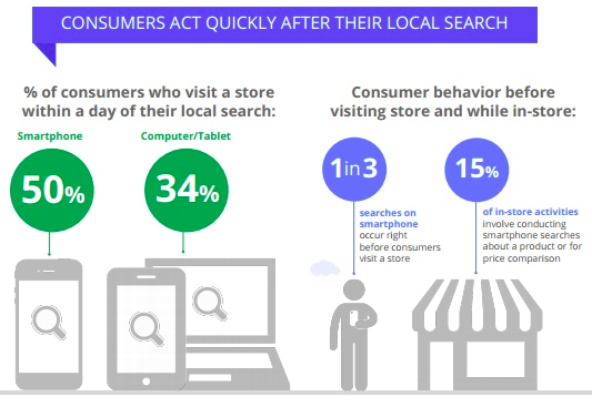
Make your page title shorter so that it fits into mobile screens. You know there are smaller screens. Other on-page optimization should apply. If you’ve done a lot of desktop SEO work, you might just need to do small extra work.
To test your website’s mobile responsiveness, you should use the Google mobile-friendly tool. You can find suggestions from the tool on what to improve to make your website appealing to your mobile users. For example, let’s see if https://www.patimex.com/ is mobile-friendly:
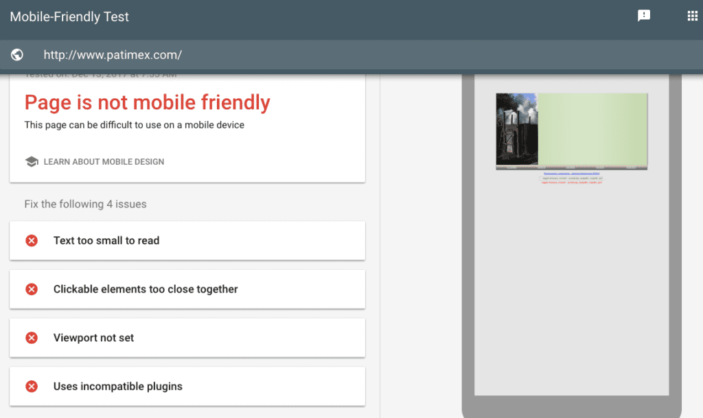
Oops. This is so bad. You can see that there are suggestions there to guide you. You can click on those links for more information.
5. Provide direct, actionable information relevant to the query
Have you searched for something on Google before and saw a result that looks like it contains the answer to your query but unfortunately, the content is completely different from the title? It’s called a clickbait headline.
It happens a lot. Maybe it doesn’t happen again as the search algorithm are more sophisticated nowadays. If you’ve got your users’ interests in mind, you’ll provide relevant and actionable content to match what your target audience is looking for. You might think you’re only doing your business good by using those keywords to attract your customers. Yea, but the truth is, you’re also doing a great job of helping your audience find the right information to help them solve their problem.
You could use Google’s keyword research tool to discover the keywords your target audience is using and try to fulfill them by creating content that answers their questions.
While this might seem like full-blown SEO, it’s also a part of user experience because, definitely, users will be happy to consume content that actually solves their problem and if it’s coming from you, you might find them coming back for more. That will most likely lead to more conversions.
According to a study by Conductor, consumers are 131% more likely to buy from a brand immediately after they consume early-stage, educational content.
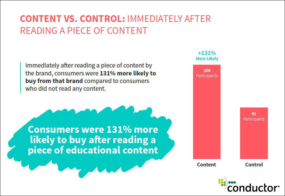
From the same study, it was also discovered that given a lineup of 4 brands to purchase from, 83.6% of consumers chose the brand that provided them with educational content.
So that means, instead of customers starting a search for educational content through Google, they’ll most likely just visit your website directly to either buy or read the content. Since they know they can always get the best from you.
Why do SEO experts in Orlando and other cities visit Rand Fishkin’s Whiteboard Friday every Friday? In fact, some even set alarms to remind them. That’s because of the value Moz provides with the whiteboard Friday and is directed to help SEOs get better and of course, it establishes them as experts in the industry.
6. Professionally designed and accessible to modern browsers
If SEO can no longer be separated from UX then a professional website has a correlation with boosting your SEO efforts.
Designing a professional website doesn’t mean using all the JavaScript plugin and adding all the cool unnecessary stuff to your website. A professional website gives the visitor a feel-at-home kind of feeling.
It makes it clear what you have to offer and what the visitor will benefit in return through a clear value proposition. Yes, it also converts a visitor into premium customers.
A professional design doesn’t make accessing the website difficult. Because this can affect your rankings.
For example, if a customer is trying to access your website from a search result and it’s taken too long for your website to load what do you think they’ll do? Bounce and move to another website. Right? That’ll account for over 100% bounce rate. Which is bad. Google doesn’t want their customers to pass through such pain, they’ll take your website’s ranking down and push up websites that are faster to access than yours. So they don’t lose their users to other search engines just like you. Get the point?
Users are becoming very smart and impatient. According to the Nielsen Norman Group, a website’s loading speed has such a huge impact on brand impressions that it can become one of the characteristics a customer associates with a website.
Take control of your page speed. Use speed testing tools like Google’s Speed Test tool, Gmetrix, Webpage Test to test the speed of your website and find suggestions to improve the speed. Then follow the instructions to improve your page speed. One other thing you could do is to minify your JavaScript. Minimize the use of embedded multimedia content from other sources.
Don’t use flash, image files that are too large can play a huge role in slowing down your website. If you’re on WordPress, you could use plugins to optimize your images, enable compression, and browser caching, and optimizing CSS delivery.
Doing these things will allow you to boost your website speed a great deal.
Broken links are a nightmare. They don’t just harm your SEO they just turn your customers off. Imagine a customer that wants to check out the button on getting to that point gets a 404 error. “Page doesn’t exist”. That’s a huge turn-off. You should take your time to figure out all broken links and fix them. Proven.com fixed their broken links and that contributed to boosting their traffic by 48.7%.
Your choice of colors for your website is a big deal. Be Careful when choosing colors for your website and for your call to action. Use the appropriate color combinations. At most, making use of 3 colors is okay.
There is a website I visited some months ago while conducting research, their font size was about 6pt. I was only able to stay and consume the content because it was valuable to me. I complained to them unfortunately, they didn’t increase it. I wonder how much that is hurting their customers and of course, their conversion.
Use moderate font sizes and font style. Don’t use writing font styles, it’ll be difficult to read.
Another thing you want to take your time in doing is to ensure that your website is cross-browser compatible. That means your customer’s visitors will enjoy the same experience across browsers.
Different browsers have different ways they render your website ensure you test on the different browsers, see how your website looks there. If there is anything you need to add to optimize it for the specific browser, make efforts to do that.
7. Deliver high-quality, legitimate, credible content
Content is king. Yes, even over SEO.
“Content is where I expect much of the real money will be made on the Internet, just as it was in broadcasting.” – Bill Gates
Yes, Bill Gates saw the future. Content marketing is the new SEO. Unlike other traditional advertising techniques, content marketing allows you to sell to your customers without actually selling to them. It allows you to tell your brand stories such that it resonates with your audience and compels them to buy.
If you create amazing content for your audience, you’ll be loved by Google (Google loves great content), your visitors, and you’ll generate loyal customers.
Great content is the best SEO tactics out there today. No Google’s algorithm will catch up with you soon if you create high-quality unique content.
However, some people make the mistake of thinking that SEO and content marketing are separated. No. There are the same. If there are any SEO tactics you want to put most of your investment in, it should be content marketing. There is no such thing as SEO without content. You definitely need words, articles, substance, keywords, verbiage.
So how do you create content that your visitors will love and search engines will smile at you too and rank your website on their first page?
i). Run keyword research to determine what your prospects are using to find your business.
Yes, this is SEO 101. And for your customers to be able to have the chance to find you, you have to start from here. Like I said, SEO can’t be separated from content marketing.
Use Google AdWords Keyword Planner tool to search for the keywords your audience is using to find you. What questions are they asking? Create content to answer their questions extensively.
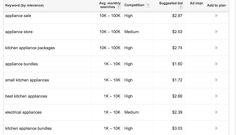
Gather the keywords that make sense to you and use them to create the content that will attract your customers. Be careful not to stuff your content with those keywords because you want to rank higher.
Google algorithm will visit you and you’ll be penalized. Besides, your readers won’t gain anything from the fluffy keyword condensed article.
ii). Keep Your Slug Short and to the Point
Don’t use a confusing slug. Or a slug that doesn’t represent what your content is all about. Use a shot and simple one. Most people look at the slug before even clicking through to the website. Here is a good example of how you can use slugs effectively.

While slugs are important for SEO, they also support readers to find the best content that’s suitable for them.
iii). Include inbound and outbound links
Links are what makes up the internet. They allow people to navigate from one page to another.
If there is need to point your audience to an amazing content or case study, don’t hesitate to link out. And also interlink your website content effectively to point your audience to similar content that explains a keyword or phrase better.
iv). Length of text
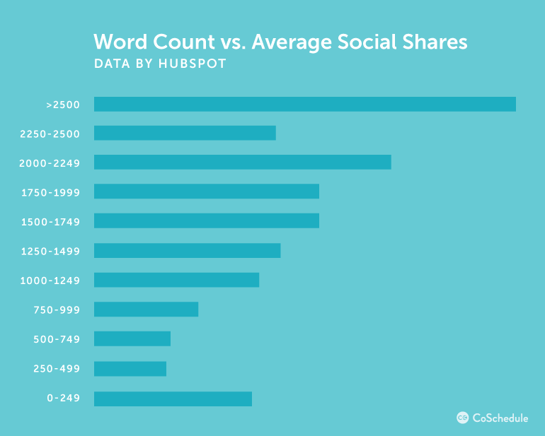
A recent study by Brian Dean shows that long-form content performs better than short content.
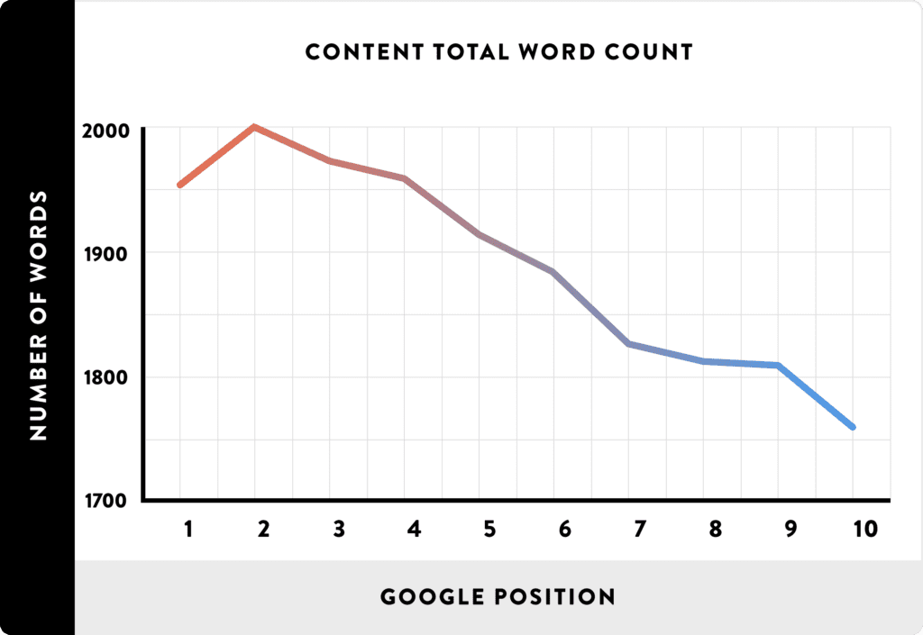
From the study, it was noticed that content pages at the first, second, and third positions were content with 2,000+ words. Make your content interesting so that it engages the target audience.
It has been proven that content that contains 2,000 words or more performs very well on search engines.
v). Length of page title
It’s important you consider making your page title short since you don’t want it to get cut off in search engine results.
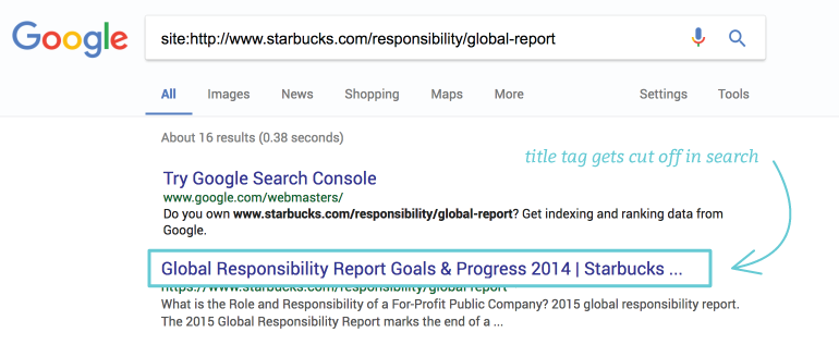
Make your title interesting and catchy as well such that it pulls your target visitors in.
vi). Focus keyword appear in URL
Your content should have a focus keyword. If you’re using Yoast SEO plugin, you’ll be mandated to provide your focus keyword.
The focus keyword is what the user will likely see and decide whether your content is for them or not. It’s kind of one word that describes your entire content. Ensure that it’s included in the URL.
Here is an example: See the focus keyword in the in the title, in the URL, and also in the description. That’s the point. You don’t have to stuff it. Just mentioned it once and naturally.
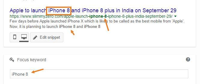
Studies shows that beyond allowing your audience know what your page is all about, it’s also very important for SEO.
vii). Subheadings
Subheadings allow readers to scan through your content easily. Also, subheadings allow search engines to know what your content is all about especially when you include your target keywords or related keywords in the subheadings.
viii). Write short sentences
Short and clear sentences make it easier for your users to digest smaller chunks of text and ideas without burning out easily. You should use it consistently.
ix). Use short paragraphs
Yes, using short paragraphs is a no-brainer. It makes your content easy to read. While writing, ensure that each of your paragraphs is made up of at most, 3 sentences.
Conclusion
User experience has a huge impact on your organic search visibility. The focus of your SEO campaigns should be on your users. That way, they will stick around, click your search results, spend more time on your website, and send lots of engagement signals to search engines.
Trust me, that’s what you need to drive organic traffic and search rankings to your website.
User experience is a great way to augment your traditional SEO efforts, it indirectly impacts your search rankings and traffic, brings satisfaction to your users, and helps you optimize your website to attract leads and customers.


