A funny thing has happened in the online business world in the past decade, something that we never expected to happen. People who do business on the web have lost touch with the fundamental operating mechanics of the web! Even the designers and developers now are losing their grip on basic Internet concepts.
This is nobody’s fault, to be honest. Technology has gone along making things easier for us and more abstract. As it has, certain assumptions we’ve been making about how “everybody knows this basic stuff” have turned out to be wishful thinking. Over thirty years, we’ve gone from “you have to read this HTML (hypertext markup language) manual and pass this exam” to “just install WordPress, it works!”
The problem with technology improving to the point of machines doing more of the work for us is that we all run around assuming everybody knows how the underlying infrastructure works. Surely, somebody must have told you that web pages have to link to each other? Don’t they teach this stuff in school? No, actually, they don’t.
It is nobody’s fault. There’s no reason to feel foolish for not knowing these basics. There’s no reason for teenagers to feel bad for not knowing how to use a rotary phone, either. Good riddance to those things.
But Google Assumes That You Know Website Structure!
Google is assuming that your web page follows webmaster guidelines and that you understand how Google’s bots find their way around your website. We’re also probably all guilty of assuming that everyone understands concepts like “an HTML hyperlink (“a href=”) must contain the URL (universal resource locator) of another page to make a clickable link to that page.”
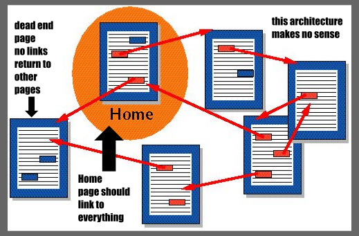
We’ve also been telling everybody, for effective digital marketing, “content is king.” Keep adding content, everybody! Which you all do because you’re smart cookies. But we forgot to tell you how to structure that content so Google can find it. Not only that, but it would be nice if web visitors can find their way around too. The two concepts are related because Google uses hyperlinks to crawl the web, and users use hyperlinks to navigate your site.
When you keep adding content without managing its accessibility, you have a problem with something called “information architecture.” Information architecture is a new science. The World Wide Web is only thirty years old; nobody had to deal with this stuff before.
The simpler you make things for both Google’s bots and website visitors, the better your content will work for you, and the more business you will enjoy! Let’s not forget, when we say “make things simple,” that some of our visitors might be elderly, or handicapped and using website accessibility aids, or simply not that gifted at technology. You have to allow for phone users with clumsy thumbs who may not find it so easy to tap a tiny link in a list.
So we’re going to blow away the cobwebs with this lesson. Even if you’re a web wizard, stick around, because you might have missed a couple of these points. Information architecture can require ongoing maintenance, because as you add more and more content to a website, it becomes more chaotic, like your garage getting piled up with stuff. You have to clean it up and sort it once in a while.
Blog Structure:
We’re going to assume that you’re using WordPress. If not, everything we will be covering will apply to any blog software or content management system (CMS). This is going to be about website navigation, and making it easy and sensible for both Google and your visitors to find their way around.
Give Googlebot a Map
Quick, before we head anywhere else, let’s talk about sitemaps. A sitemap is generated by having your crawler crawl your site, then put every link it found into a single file, which it names “sitemap.xml.” Ideally, you have that file stored on your server for Google to find. This helps Google index your site.
Now how to get a sitemap? Here is one tutorial for generating it from inside WordPress. If you have more to your site than just WordPress, you may need something else. Web hosts that provide cPanel probably have a sitemap generator available on the menu. You can also find several free web services or downloadable utilities to generate a sitemap, but you should keep an eye on quality. Sitemaps are actually harder to get right than most developers seem to acknowledge.
Categories and Tags
WordPress lets you use both. What is the difference? A category should be a major section of your website content. Tags should be minor common groups of topics within these major categories.
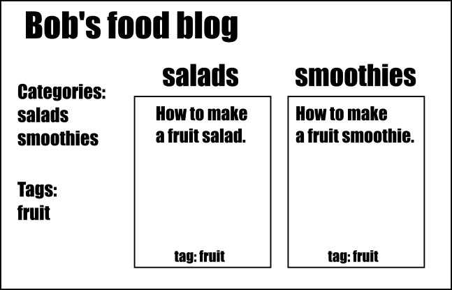
In the above example, one blog post belongs in the “salads” category and one belongs in the “smoothies” category. But both of them get the “fruit” tag because they both involve fruit. Here are a few rules of thumb to keep in mind:
- You only want categories to be broad and general. We’re assuming a food blog will have many posts about salads and smoothies.
- You want tags to be narrow and specific. We’re assuming that fruit won’t come up as often, so it gets a tag.
- It’s fine to have multiple categories and multiple tags on one post.
- You should usually avoid single-entry categories and tags (but this is unavoidable if you just started a new category or tag with one post so far).
- You must avoid duplicate categories and tags.
You should avoid under-populated categories and tags because WordPress creates a separate page for each category and each tag. Thus if a “fruit salad” post is the only post in both the “salad” category and the “fruit” tag, you’ve created three pages of duplicate content. That is bad for search engine optimization (SEO). What will happen is that Google will rank one page lower than another, which it will randomly pick. Too much duplicate content on your site may cause Googlebot to simply give up trying to crawl it.
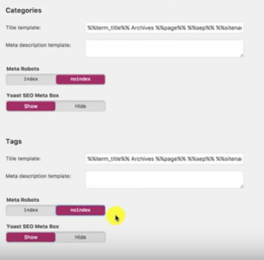
The jury is split on this issue. Some advocate turning on the “no follow” feature for categories and tags. We say you should never “no follow” your own internal links. Tags and categories are valuable site interlinking structures, sometimes the only way Google will find its way to every page on your blog. Instead, just keep your tags and categories straight. This also means that if you write so many posts about fruit that you decide “fruit” needs its own category, you have to delete the “fruit” tag and promote “fruit” to a category. You don’t want categories and tags with the same name because that also creates duplicate content.
One more thing: Tags and categories are not to be used for keyword purposes! We have seen people publish a blog post and then the tags under it go:
> tags: fruit-salad, fruit-salads, salad-made-of-fruit, fruit-salad-recipe, fruit-salad-recipes, salad-recipe, salad-recipes, what-to-use-in-a-fruit-salad…
This is horrible, because it will create a separate tag page for each tag, and all of those are only likely to get used once. What’s more, Google doesn’t “count” the categories and tags when indexing a page for keywords. Keep your keywords in the blog post text, headings, and title.
Managing Large Blogs
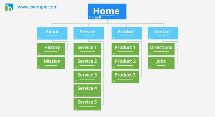
There’s a rule of thumb that is called the “three-click rule.” Also called the “three tap rule,” it means no page on your website should be farther than three clicks (taps) away from any other page. There is some controversy about this rule, but we hold firm to it because of Googlebot’s crawl depth.
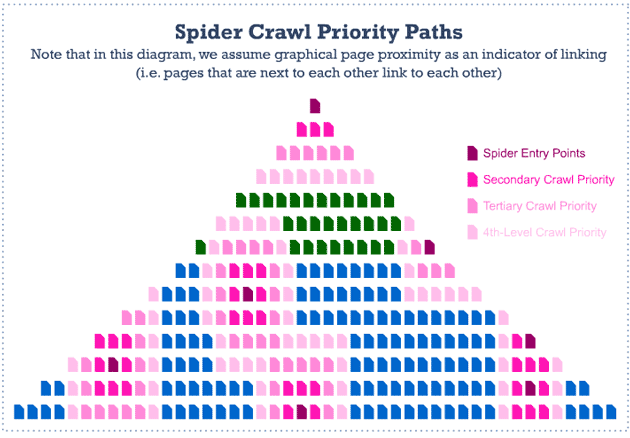
Surprisingly enough, this diagram is showing a relatively small blog. When Googlebot crawls your site, it likely arrives at a prominent page: your landing page, your home page, or a heavily-backlinked post. It then has to follow links from there to crawl the rest of your site. If your site has good interlinking, it will be able to find the rest of your site within a few hops from the entry point.
Here’s our problem: By default, most WordPress templates don’t scale well with larger blogs out-of-the-box. The way you navigate to older posts is by either scrolling to the bottom (infinite scroll) or by clicking a “next page” button. Both of those are inadequate for a blog with more than five pages. If you have 50 posts on your blog and it loads five posts per page by default with nothing but a “next” button to navigate, you get this:
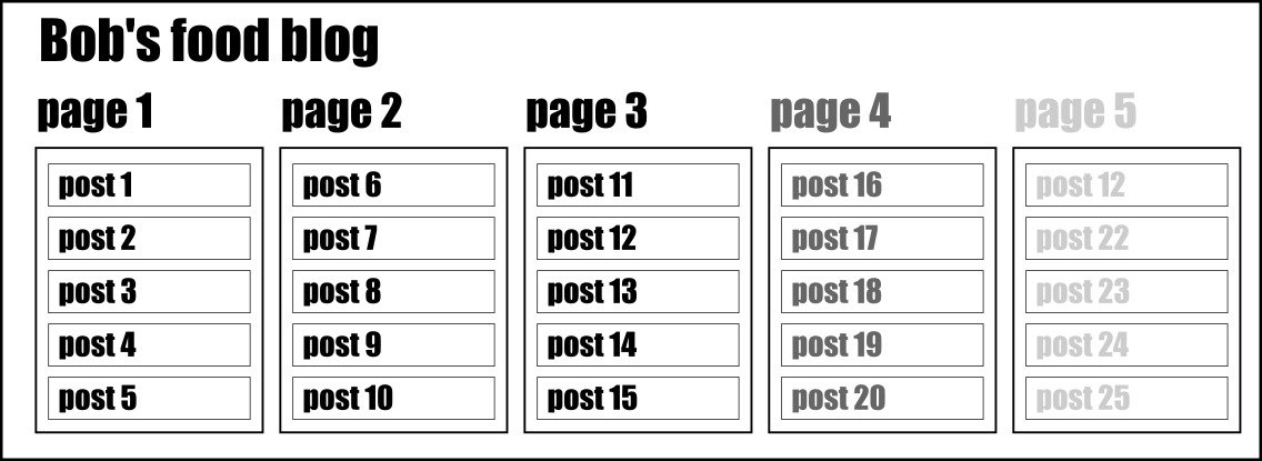
If you have 100 posts with this model, forget those early posts, they are lost to history. Googlebot is busy and is only going to spend so much time indexing your site. With an unreasonable crawl depth, it gives up.
How to solve this problem?
#1 Turn on breadcrumbs:
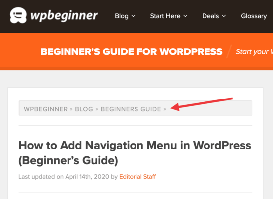
Breadcrumbs are a little path at the top of a page showing its path within the site’s page architecture. Each of the breadcrumbs is its own link. From this page, Googlebot (or your users!) can pop right to the current category, or to the main page of the site. Breadcrumbs work well on bigger sites with many finely differentiated categories.
#2 Add numeric page navigation:
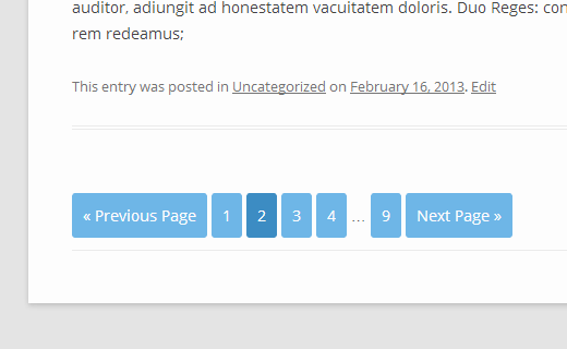
This is the best solution for bigger blogs of any size and structure. Just having the “next” and “previous” buttons aren’t enough. Numeric page navigation instantly puts every single page of your blog within one click of your front page. Isn’t that amazing? Why doesn’t every blog do this?
At least it solves the problem until your blog grows to about 100 pages or more, at which point it won’t show all of the numbers. Some numeric page navigation plugins solve this by grouping pages by fives or tens or letting the page numbers spill into a second row, or letting you skip to the last and first page and click back or forth from there. Whatever it does, any numeric page navigation bar is better than nothing.
Why not both?
Yes, we say use both! We have never seen a blog fail from being too easy to navigate. Remember, we have users who might want to jump from one category to another, or other users who love your content so much that they’re binge-reading the whole site a page at a time. We have other users who might not want to scroll all the way to the bottom of your blog with their arthritic thumb. Make it easy.
Other Navigation Features
- Archives: Best for blogs whose posts number past 200 or so. Easy to set up. Once again, you have the navigation problem licked forever.
- “Most popular posts” feature: Yes! You’ve seen blogs with this feature in the sidebar. Of course, your most popular content is likely to be your most important content, so why not plop a link to it right there?
- Recent posts? No. Most blogs that show “recent posts” have links to the five posts you’re looking at on this page, plus five more that are one numeric-page-navigation click away. Not worth the space.
- Calendar navigation: Is your blog more than five years old, and more importantly, do you post at least three times per week? Then a calendar might be a useful feature. But it’s still too fiddly to use on mobile. This is a judgment call.
Remember also that on mobile with some page layouts, the sidebar becomes “the bottom bar.” This means every time a user wants to access it, they have to scroll all the way to the bottom. Some mobile WordPress templates solve this with the “hamburger menu”:
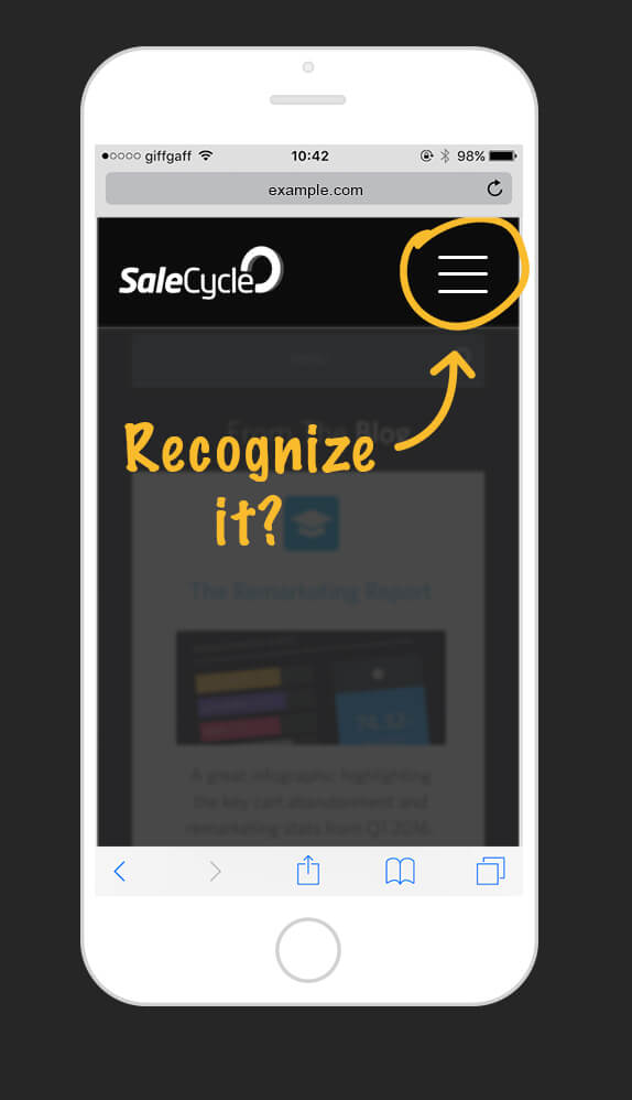
This is an icon that users can tap, and out spills a menu of navigation goodies.
Our bottom line is that you should always consider “what makes it easy?” Put yourself in the mindset of the world’s laziest user. Because Googlebot is also a little lazy, so “easy for users” and “easy for Googlebot” is usually the same thing. If you have several redundant navigational aids, that’s fine. If you have too little navigation, that’s a disaster.
Helping Lost Users:
This section has more to do with user navigation than Googlebot, but there are a couple of points that connect to SEO as well.
Site Search

Here again, this is a free feature that WordPress and any other CMS provide. So why isn’t it turned on for every site? We will never understand. Users come to your site, look around, then decide they liked the products you offered three pages back but they don’t remember how they got here. Or your prior customer returns to your site, wants the same service again, but forgets where to find it.
Why not have a site search? It is free customer retention. It may even help you sometimes when you’re writing a post and want to link to another time you mentioned this topic, but forget the name of the post.
Helpful 404 Pages
When an inbound link leads visitors to your website, but the page is not there for some reason, they get a 404.html page instead. You can create a custom 404 page instead of the default one that the Apache webserver generates. Our troubles with 404 pages began when at some point, Internet culture collectively decided that 404 pages should be silly.
Imgur’s goofy gallery:

Reddit’s bewildered alien:
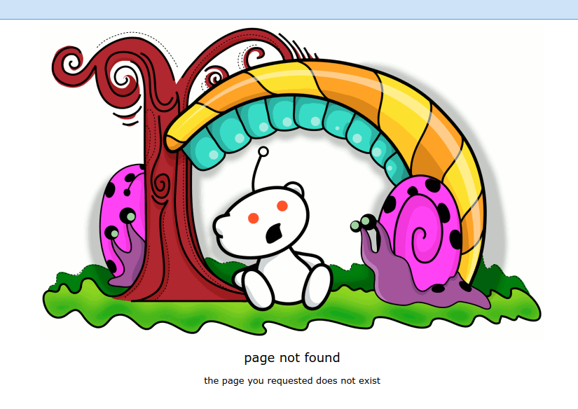
AirBnB’s sad kid:
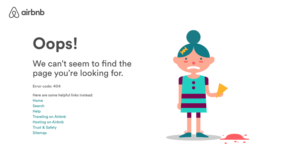
These go on forever. We suppose people have to have their fun, but we could also put the 404 page to some serious business. Put some links there. Airbnb has the right idea: several links are offered to the home page, to a search feature, to a help section, and several other common destination points. This is a great idea. Turn that lost link into an opportunity.
Bloomberg Business actually used to have this animation as their 404 page. That’s hilarious, but not very useful. You can customize your 404 page from WordPress, and then try to retain some traffic instead of sending the user off empty-handed.
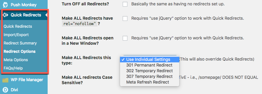
When you delete or move a page on your WordPress site, you can dodge that 404 by setting up a redirect instead. Maybe that’s not always the best choice if the content you’re deleting is gone for good with no replacement. Internet etiquette dictates that you should let the user get to the 404 so they know the original link is not viable (they may want to change that link or notify the other website of the dead link), then offer them a link to a more helpful page.
The 404 visit shows as an error on your own site’s error logging feature. Use that information to reclaim that dead backlink.
Fixing Problems:
The biggest tool in your toolbox should be a site audit feature on your favorite website SEO or analytics tool. Here is a sample of errors found in a SEMRush audit for an undisclosed website:
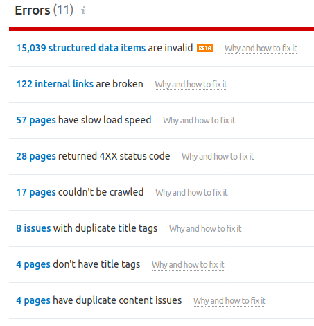
It will be different for everyone, of course.
- Structured data errors can be breadcrumbs (we covered above), for example, you had posts listed under an author’s name, author quit and deleted their author page, orphaned posts.
- Broken internal links are links going from one page to another within your site, usually caused by deleting or moving a page.
- Pages that can’t be crawled. This is why we frown on “no following” your own pages. It is too easy to drop in a robots.txt file and then forget about it until years later when you’ve lost track of it. You also might have switches set in WordPress that need to be unswitched.
- Link rot: External links that are 404. This is an inevitable consequence of a chaotic web. Try to find a replacement, or contact the external site owner to see if the link can be repaired by pointing to the new location of the original content. You just might make a new friend this way!
See our SEO metrics page for more website monitoring tips.
Conclusions:
We have covered a whole lot more ground than most readers would have expected within this topic. We’d hazard a guess that even if you’re a salty web veteran sailor, you have learned at least one new fact today. We constantly see websites that are living in the dark concerning most of the above information, so we guess somebody out there isn’t getting into their remedial webmastering class.
Why do we advocate so much navigation maintenance and redundancy? It’s the work webmasters (editors, bloggers, developers, staff) tend to neglect. It’s no fun chasing down a structured data error. But bad navigation is leaking money for your business. Remember, your competitor is optimizing their website and will welcome your lost lead!
Remember also that your users are human. They might be visiting your website while they are tired, grumpy, stressed, multitasking, or otherwise not at peak performance. The easier your site is for them to use, the better. The easier we make the World Wide Web to navigate, the better it is for all of us at once.

