The year 2020 may have completely upturned the lives of digital marketers, but one thing hasn’t changed (and probably never will): the need to attract and convert people into leads, sales, and customers. The evolving ways in which we’ll attract people to our digital entities is the work of another blog post (see 2021 SEO trends, 2021 Facebook ads trends, and 2021 digital marketing trends). In this post, we’d like to explore conversion rate optimization (CRO) and the trends that will drive this important part of digital marketing in 2021.
Wait, What is CRO Again?
Conversion rate optimization (CRO) can get a bit technical, so we like to break it down into simple terms:
- Get people to your site.
- Turn those site visits into tangible, revenue-generating outcomes.
A “conversion” might look like a form-fill to download an eBook, for example. A purchase from your eCommerce shop. Or maybe it’s a trial sign-up or direct purchase of your software subscription. Your “rate” is the percentage of people that end up completing your desired goal, usually a percentage.
With this in mind, we urge you to consider CRO from two perspectives:
- How people are getting to your website or digital experience (the journey from an ad, social media post, etc.).
- What people are doing once they’re on your site.
This gives us a bigger picture of all the key “touchpoints” along the journey, from awareness to conversion, each of which can be optimized to increase the chances that somebody makes it to the finish line. These include:
- Display and pay-per-click (PPC) advertising
- Landing pages
- Blog posts
- Website copy
- Site structure, navigation, and page speed
- Email and text messaging campaigns
- Calls-to-action (CTAs)
- Forms
What’s so interesting about CRO is that the discipline is all about getting more out of the website traffic you already have. It’s an opportunity to test, tweak, refine, and rebuild so that more people make it to the finish line (a purchase, a download, etc.) when they reach your site. And the reward can be tremendous, both in terms of revenue generation and overall user experience.
Important CRO Trends for 2021
Optimizing these digital experiences can go a long way toward maximizing your investments in digital marketing, which will remain imperative now and into the future. We’re talking R-O-I. To that end, here are the CRO trends to keep an eye on 2021.
1. UX Will be the Undisputed North Star
User experience (UX) has long been an essential part of CRO. Ideally, we’re always designing digital experiences and customer journeys from the user’s perspective and for the user’s benefit, even if our ultimate goal is a conversion or sale. Google seems to agree. According to a May 2020 Google Webmaster Central Blog post, Google Search will now factor UX signals into its rankings, including new Core Web Vitals. Here’s more detail from the Google team:
“Core Web Vitals are a set of real-world, user-centered metrics that quantify key aspects of the user experience. They measure dimensions of web usability such as load time, interactivity, and the stability of content as it loads.”
With these updates, Google is signaling its own greater emphasis on “delightful” web experiences for people—on things loading fast, is easy to use and find, and accessible across all devices and platforms. Sites that can deliver this caliber of user experience will be rewarded with better search visibility, yes. But there’s a broader takeaway for folks in CRO:
The market has spoken, and the user needs to be at the center of every decision you make.
This explains why all of a sudden—and despite how well they sometimes perform—things like pop-ups are souring in the eyes of users and CRO people alike. Do pop-ups capture lots of leads? Yes, they certainly have that potential. It turns out, they’re also annoying as hell.
The question is, can we execute things like pop-ups in a way that maximizes conversions while adding to the user experience on your site? And can we do it in a way that’s not misleading, underhanded, or opaque? This will be the work of CRO specialists in 2021. Because bad UX leads to bad bounce rates, which directly impacts conversion rates and search rankings.
It’s hard to convert people when they’re not sticking around.
2. Speaking of UX, Your Site Speed is a Big Deal
First, an anecdote: I was poking around doing some research about UX and I had to chuckle: it was a blog post touting site speed that took more than three seconds to load because of all the crap crammed onto it. In most cases, I’d bail if a site took this long, as would most users.
What does that mean for CRO specialists? The data overwhelmingly shows that, if your pages take too long to load, users tend to bounce before even considering your offer. Check out these stats from a recent Akamai study:
“A 100-millisecond delay in website load time can hurt conversion rates by 7%. A two-second delay in web page load time increases bounce rates by 103%. 53%$ of mobile site visitors will leave a page that takes longer than three seconds to load.”
A 7% hit on your conversion rate hurts. A lot. Imagine that kind of hit on an eCommerce experience that generates $100,000 a month.
Again, it’s hard to optimize experiences for better conversions when you’re losing people at step one (or even before step one, if you consider the fact that the Google search algorithm penalizes slow-loading pages). The good news is that page speed is a solvable problem. We recommend that you start with the PageSpeed Insights tool from Google, which will help you identify actionable recommendations for improving page speed across your site.
3. Oh Yeah, and Don’t Forget Mobile-first Optimization
Seriously. Mobile optimization is critical. It’s up there with site speed in terms of top UX priorities.
Why? Because lots and lots of people will be interfacing with your digital channels on mobile devices. Emarketer.com predicts people have been spending 23 additional minutes per day on their smartphones in 2020. According to Statista, there are more than 3 billion smartphone users worldwide, a number that is expected to mushroom significantly over the next couple of years.
The emphasis on mobile experiences isn’t necessarily news. But the pace of change and innovation seems to accelerate each and every year. Only a couple of years ago, optimizing for mobile responsiveness was on the top of the list for CRO experts. Today, the focus is optimizing for a proliferation of new mobile experiences, including voice assistants, augmented reality (AR), and mobile “Near Me” search experiences.
One area that CRO wonks are zeroing in on is the mobile checkout experience. Google estimates that the average mobile checkout experience requires 120 “taps” (mobile clicks), with a 27% abandon rate. That’s A LOT of potentially missed revenue. But the data also sheds light on CRO tips that apply to a variety of mobile experiences:
- Test the experience yourself on a variety of mobile devices, screen sizes, platforms, and operating systems. From start to finish, how long does the process take? How many “taps”? Where are the potential snags for the “lay” user? These are opportunities for improvement that will translate into better conversion rates.
- Make it easy to pay with common mobile payment apps. Can your users authenticate and pay with Google Pay, Apple Wallet, PayPal, and other mobile payment apps “in the flow”? The key is to limit experiences that take users away from your mobile experience, which can lead to higher abandon rates.
- Keep it simple. From a graphical and textual standpoint, less is more on a mobile phone. Asking users to consume a lot of information on a tiny screen is just asking for increased bounce rates.
Our article “Google Core Web Vitals: What to Know and How to Prepare” shares actionable recommendations for optimizing your website for mobile, increasing page speed, and addressing other critical UX requirements.
4. Personalization Will be CRO’s Best Friend
According to research from Epsilon, 80% of consumers are more likely to make a purchase when brands personalize the experience. I suspect that’s because people want to feel like you understand them and that you’re speaking to their needs. For the CRO specialist hoping to take flight in 2021, this means finding new approaches to personalization segmentation.
One fast-growing approach is to give your site … multiple personalities. Meaning, you can plan and build digital experiences specific to a group of users. Using certain software solutions, such as Optimizely, you can load a version of your webpage for certain users. Maybe you have a location-specific lander for users from a certain city or country, with messaging and appeals tailored to that audience. You can even get granular and only show certain versions of certain page elements, such as images and CTAs, based on certain “conditions” (user data).

Personalized landing pages can be used in conjunction with highly segmented—and personalized—email marketing campaigns to increase conversions. Tailored, personal messaging addressed to a real person and from a real person goes a long way. But new software is making it possible to take email personalization further, using AI to automatically suggest the best content to include in, say, a monthly newsletter, based on the list that the email is going out too.
Identity access management (IAM) will be big in 2021, too. One common refrain we’ve heard from CRO specialists is, we’re losing them on the login. Meaning, they put users on a beautiful, connected journey to a purchase, only to lose them by a login/authentication experience that takes them to another page or interrupts the user flow. Finding seamlessly integrated ways for users to authenticate, then personalizing the content they see based on their profile, will be a key part of CRO moving forward.
Google and Facebook are probably the gold standard for these authentication experiences.
5. Trust Will Come with Designing for Transparency
People aren’t likely to buy from you if they don’t trust you. This is especially true in a market rife with data breaches. In 2020 alone, we’ve seen five million people exposed in a Marriott data breach, 267 million compromised Facebook profiles, and 142 compromised guests in an MGM Hotel breach. Beyond these breaches, major software producers and platforms, such as Facebook and Instagram, are coming under increased scrutiny around how they attain and use user data.

Trust can impact conversions. This is why 2021 will continue a public and institutional call for “transparency in design” that’s becoming increasingly loud. Here are a few examples of what that might look like:
- Disclose data usage loud and clear on your apps and websites. Don’t bury your data usage and privacy policy somewhere that’s hard to find. And if you make changes to it, be sure to update consumers.
- Review default data usage settings and give users the option to opt-in (rather than making this setting the default). Most users are quite chagrined when they find out an app or website is automatically tracking their data without their consent or awareness.
- Invest in secure systems and vendors. If you’re using IAM, for example (mentioned above), choose a vendor that meets high standards for security compliance and data protection to avoid leaking sensitive customer data.
- Don’t surprise people with the price. This is especially important for eCommerce experiences. People who feel surprised by a price at the last stage of checkout will likely bail on the experience altogether. I know I would. Make it clear to the user each step of the way what they’ll be paying for your product or service.
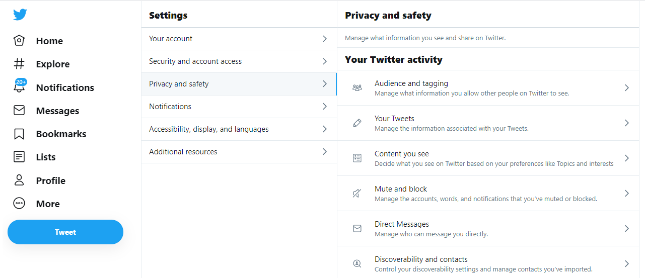
- Tell users which apps have been granted access. Twitter is a good example of this: within Twitter settings, users can find which apps have been granted access to Twitter for things like personal data, tweets, contacts, and so on. Facebook and WordPress have similar pages. Some people are surprised—or flat out forget—that they’ve given permission to third parties to access their data on a certain platform. Make this information well-known to your users.
6. There Ought to be Closer Collaboration Between Design and Data
Organizational silos be damned! Seriously, though, the days of web designers, advertisers, data people, and marketers sitting in separate rooms with blinders on are over. And while that’s not exactly news, the need for collaboration between these groups has particular bearing on CRO in 2021 and beyond (see #5, for starters).

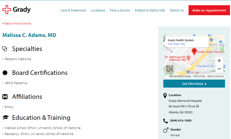
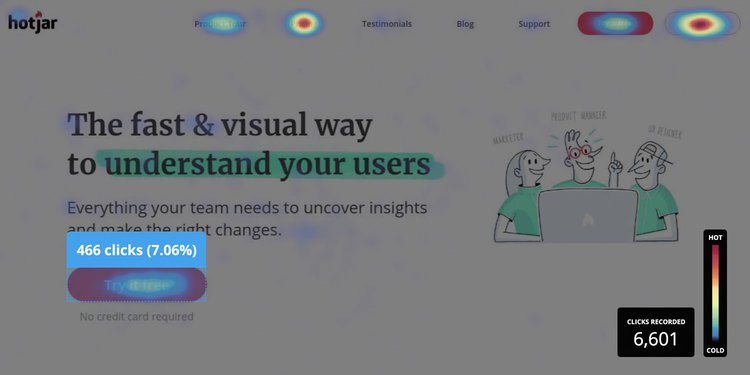
According to McKinsey, the top companies integrate design across the organization. How might this look? Take, for example, a healthcare marketing website. The internal consensus among web design experts and copywriters might hold that the users should first be guided to a specific department. However, heat mapping data might reveal what users actually want: 75% scroll down looking for the patient portal login. When teams collaborate and share data, they can uncover new insights.
Support content (help, troubleshooting, FAQ, and the like) provides another good example. Qualitative survey data, delivered in the form of feedback surveys, might reveal qualitative data points around how useful a company’s online knowledge base or help center is (“helped me solve my problem,” or, “couldn’t find what I need”). Yet, actual user search data might show that the majority of people search for a specific issue—if that issue doesn’t have adequate content, the company addresses that content gap based on what the data is telling them.
This kind of collaboration can be far-reaching and deep. Mckinsey, in the article cited above, calls it “data synchronicity.” For the world of CRO, it’s an opportunity for data people and design people to look at, build, and refine customer journeys—experiences—together, start to finish. The impact on UX and, ultimately, conversions, can be tremendous.
Final Takeaway: Be Truthful in the “Post-truth” Era
How we market, including CRO, will never be the same. The topic simply cannot be discussed without a nod to broader market conditions impacting user experience, consumer sentiment, and people’s basic humanity. Digital experiences can today feel disjointed and chaotic, a sort of wild west where hot takes, intentional misinformation, and hatred abound.
It is marketing in the “post-truth” era if you will.
Marketers and the brands they work for must be aware of how the digital experiences they publish content to, advertise on, and communicate through are impacted by the proliferation of inaccurate and misleading information. Moreover, the way that this new paradigm impacts the people that we market to must never be overlooked, “now more than ever,” as the now-common saying goes.
Building trust and transparency into the ways we create content, advertise, build, and design digital experiences will be essential not only to improving conversions, as it were but to creating safe digital places and a higher standard within the marketing discipline.
The creative ways we find to drive conversions are no exception.

