Can we be straight up with you? If you’re not investing in Facebook advertising, this is the best time to give it a shot. It’s natural to be skeptical about the ROI you can get from social media advertising, but Facebook deserves a chance.
Here’s why:
At the end of 2018, Facebook was home to 2.32 billion active monthly users ranging from students to companies to CEOs. If you’re a marketer, knowing this grabs your attention.
However, even though the numbers are clearly there, connecting to these people through advertising isn’t always easy. And for companies, posting regular updates on Facebook pages doesn’t just cut it anymore.
Of course, you could invest in your efforts to attract people to your Facebook page and then redirect them to an offer or your website, but most times you’d get little or no results.
So what’s the best approach? One way is through optimized Facebook Ads which are targeted at relevant users. These ads enable you to spend your pay-per-click budget wisely to get a good ROI.
If you’ve been looking for the best examples of relevant and successful Facebook Ads to perhaps mimic in your own efforts, then you’re in the right place. Our Digital Marketing Agency provided a list of Facebook Ad examples.
In this article, you’ll see what it takes to create eye-catching converting ads and inspiring examples that engage with your qualified audience.
However, before we dive into the best Facebook ad examples, let’s look at the different ad types and templates:
3 Main Facebook Advert Types /Placements
Type 1 – Right Column Ad
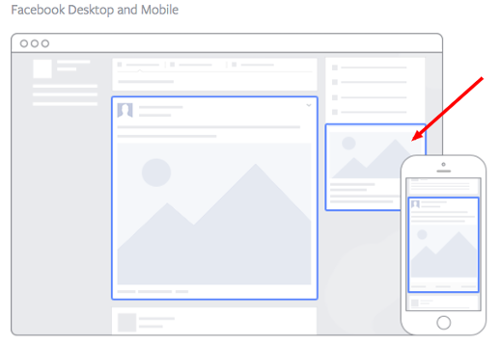
The right column advert is the most traditional ad format on Facebook. Placed on the right side of a user’s news feed, it has been in existence since Facebook started, making it the oldest ad format on the network.
Even though ads that appear on a user’s news feed are probably going to get greater engagement metrics because of this natural advertising content, you shouldn’t ignore the right column advert.
It’s less expensive to use this ad type, but for right column ads to produce quality conversions they must have good visuals, be relevant to the user, possess value proposition, and have a clear call-to-action.
Type 2 – Mobile Ad
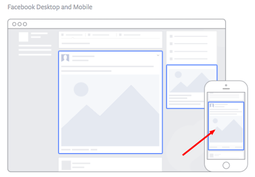
The mobile ad format is shown on members’ news feeds when they are scrolling through Facebook on their phone. It appears just like an organic post from individuals or pages they like.
Type 3 – Desktop Ad
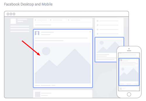
The desktop advert is just like the mobile ad type in that it is shown directly on the user’s desktop news feed and appears a lot like native advertising. This ad type has a higher engagement percentage than the column ads but they are also more expensive.
However, for these ads to be effective and produce great results then they must be visual, engaging, and follow organic post best practices. They need to appear like regular posts and not look like spam to the user.
Facebook Advert Templates
1. Photo Ad
Facebook photo ads are one of the most used ad templates since the social network began offering visual content. They appear as an image post in the users’ news feed.
The acceptable size for Facebook photo ads is 1200×628 pixels; anything greater than this and the image will be cropped and may look distorted. To best engage your audience, adjust your photo to the targeted user’s needs and watch the results start pouring in.
2. Video Ad
Over 8 billion videos are watched by users on Facebook on a daily basis, making it an extremely profitable and interesting ad template for Internet marketers to use.
What also gives it an added benefit is that video ads are shown in a fairly large size right on the user’s news feed, offering even more engaging content than regular posts.
Here’s an example of a video ad:
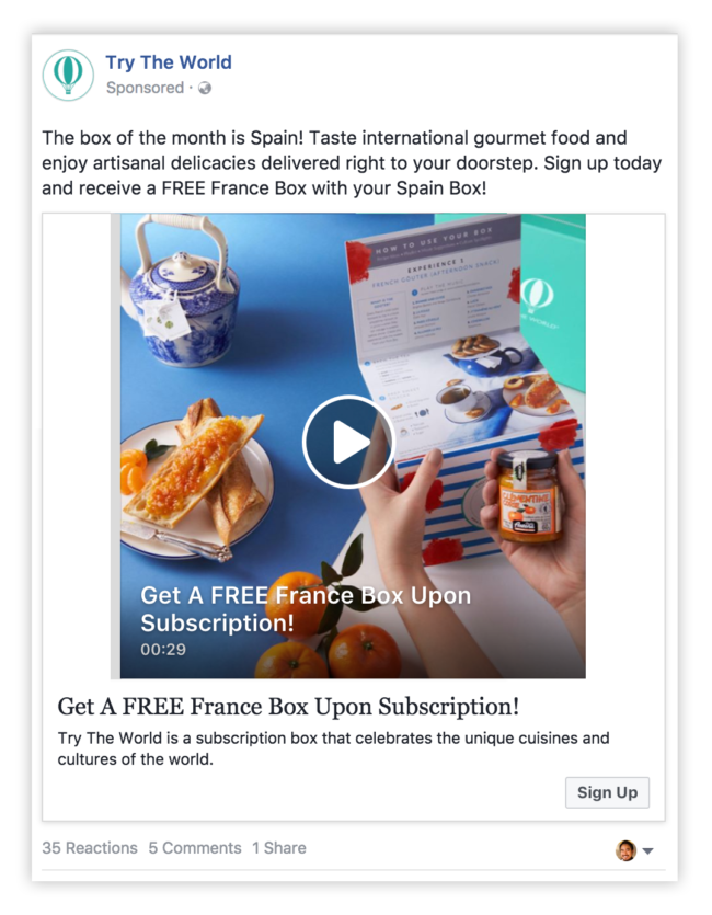
So, how do you launch a video ad? First you need to know the requirements for video ads and the acceptable video size and length.
It’s best practice to keep your video as short as you can, even though the network permits uploading longer videos. Make an entertaining and relevant video that showcases your service or product, and then upload it to the Facebook Ads Manager.
3. Reach Ad
The reach advert template is designed to create local awareness for your offer or brand, but this is only effective if your company is physically located in the area where you aim to drive traffic.
If your business belongs in this category, locally-targeted ads are the best template for you, as it enables deep targeting and a better chance for conversions.
Check out this example from Handy:
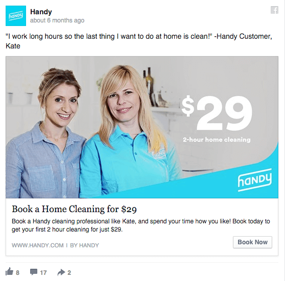
The best-case scenario is when your business has an event or offer at your storefront and you want to promote it. To do this, simply set up Reach ads and they will be shown only to users that are close in proximity to your store.
Have these ads running a few days before the event takes place and on a mobile news feed during the event.
This type of ad allows you to reach people who are around your store’s location and are using their phones to check their news feed on the day of the event.
4. Multi-Product Ad Template
The Multi-Product Facebook ad template allows you to advertise different products in a single ad using the Facebook Power Editor. Anyone who engages the ad can browse through the photos and click on a link of the particular product they are interested in.
Anything can be promoted; you are not limited to promoting not just products, but eBooks, services, blog posts, etc.
5. Event Ad
Event ads are used to promote specific events. The call-to-action of an event advert will usually direct the user to the ticket buying page, helping you drive people to be a part of your event.
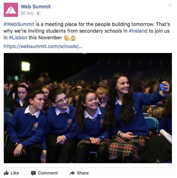
An event ad appears in the news feed of your targeted audience. Events are a major part of most businesses; however, convincing a lot of people to attend a business event or promotion is a different story.
Promoting your brand’s event to the relevant audience will help send the right type of visitors to your event.
A quality advertisement using this template will clearly reveal to users the benefits of being part of the event while also relaying the date, the price and a call-to-action for ticket purchase.
6. Offer Ad
Ever have a discount on any of your services or products and wished more people knew about it? Well, that’s just what the offer ad template is for.
This is a type of Facebook advertising that allows a business to promote discounts on a service or product and can be redeemed right on the social network platform.
Here’s a good example from Bombas:
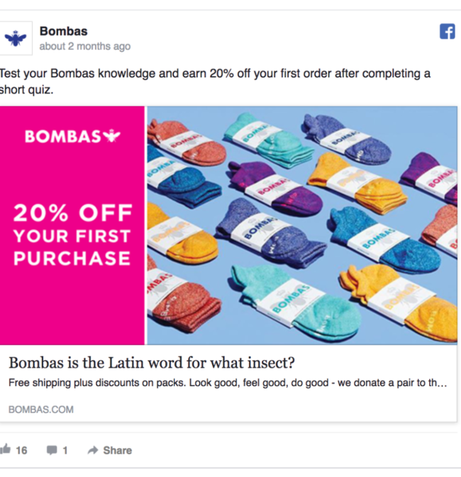
Using this template is useful in that it eliminates one step of the buyer’s journey, which will help to boost sales and conversions.
Besides that, there are numerous other benefits of the offer ad.
First, it sends the user straight to your offer. The user can claim it on Facebook, eliminating the additional action of people having to access your website to claim the offer.
Plus, it allows you to add all necessary information required for the user to decide on the offer, like they can see how many people have already claimed it, the price of the offer, and how long the offer stands. This eliminates the dreaded unqualified clicks.
7. Retargeting Ad Template
Retargeting Ads are targeted at a unique set of previously identified individuals. Ever seen ads appear everywhere as you surf the net after visiting a particular website? Those are retargeting ads.
Facebook offers this same ad template. As an advertiser, you can have your ads appear to customers within your email list by simply uploading these email addresses to the Facebook Power Editor in order to generate a custom audience.
Quality retargeting ads show that a brand is aware of the users’ previous interest in its service or product.
8. Boosted Post Ads
A Boosted Ad is when an organic Facebook post on a company’s Facebook homepage is shown to new users using advertising funds.
This differs from all other ad templates listed above because you don’t have to create it using Facebook Ads Manager; it’s just a regular post that you add to your news feed that is “boosted” to display it more frequently.
It also allows for lengthy description, as there is no limitation on word count, unlike other types of ads.
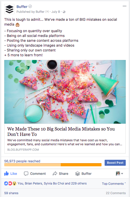
However, some cons do exist. Boosted posts offer fewer options for targeting, pricing, and bidding.
Also, it prevents you from running A/B test since the posts have already been created; you’re simply just making it accessible to more users.
Now that you’re aware of Facebook ad types and templates, let’s get into the best Facebook ad examples that will inspire you to get that awesome ROI!
Facebook Ad Examples
1. The “Build what’s next” Ad
Google certainly knows a lot about online advertising. Knowing this, it shouldn’t be a surprise that Google’s own ads on Facebook are great, even to users with fleeting interests in the services being offered.
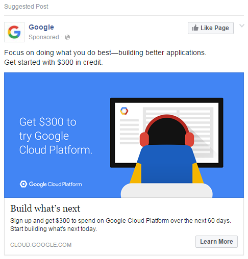
This ad gets it right in so many ways. First of all, the visual consistency of this ad with Google brand itself appears so natural and establishes the backing of the brand on the offer.
Also, this ad makes use of aspirational language to showcase the benefits of the service, which is its cloud computing platform.
Google had an array of the service features it could have showcased to users like its security or speed, but it chooses to make the emphasis on “building what’s next”.
This is because this ad hook makes the ad compelling to viewers by assisting the user to visualize the usefulness of the platform to them, which is a vital initial step in an ad campaign.
Lastly, the colors used in this advert are worth emulating. The clear, blue color blends visually well with Facebook predominant blue visuals and reinforces the emotional aspects of the color itself.
The color blue projects stability and trust, one of reasons why it is used by major tech brands.
This ad’s best qualities include:
- Projecting the benefits of your offer to the user, not its features.
- Utilizing relevant colors to the emotional response you seek to create from viewers.
- Ensures the visual consistency of your ad to the Facebook platform.
- Evokes aspirations with viewers through the ad hook.
2. New York Times Article Photo Ad
The below New York Times article photo advertisement is driving people to an article using an engaging image. The image is a drawing depicting the articles targeted audience, which is millennials:
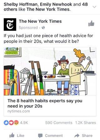
For millennials who are interested in fitness and health, the drawing alongside the compelling headline does well in getting their attention.
When you advertise on Facebook, you need to be extremely creative especially when using photo ads. For instance, in this case if the offer is an article then photo used must effectively complement the written content.
The New York Times photo ad above is an excellent example of how to advertise using photo ads.
What inspirations did you get from this ad? Here’s what we saw:
- Unconventional visuals like the quirky drawing in this photo ad draws the attention of users scrolling through their News Feed. A nontraditional image compels the viewer to take a deeper look at the offer.
- Its value prop is amazing as it shows which Facebook friends read and liked the brand. This creates an effect that makes the viewer want to read the article.
- The ad’s CTA is very clear, a key trait of successful Facebook ads. By including a question in the ad, it makes you want to click to find out more.
3. Slack’s “Make Work Better” Ad
This Facebook ad is very appealing, because let’s face it- it’s a global truth that almost everyone dislikes a pointless meeting, and that is exactly what this advert offers to solve.
Using simple yet extremely effective visuals, the ad illustrates how using the Slacks communication platform reduces the amount of wasted time in meetings by 25%.
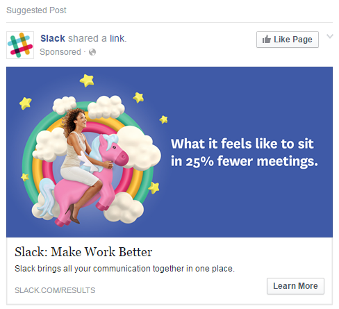
Additionally, the ad is quite playful and uses comical imagery to its full advantage, making the offer relatable and fun. The ad’s call-to-action is properly positioned by asking viewers to click to learn more, not being too aggressive in trying to get viewers to commit to anything too early.
All in all, it’s an excellent example of how work-focused communications tools can be advertised in a social media space. Also, it shows how an office app or product can be enticing.
Inspirations from this Facebook Ad:
- This ad focuses on how a customer will feel after using the product.
- A hook such as” Make Work Better” is memorable; this catchy tagline for an ad campaign creates a positive outcome.
4. The Allbirds “When Life Gets Dirty” video ad
This video ad by shoemakers Allbirds is a perfect example of the power of simplicity. Taking advantage of whitespace, it’s as basic as it gets for a video ad, yet effective when done right.
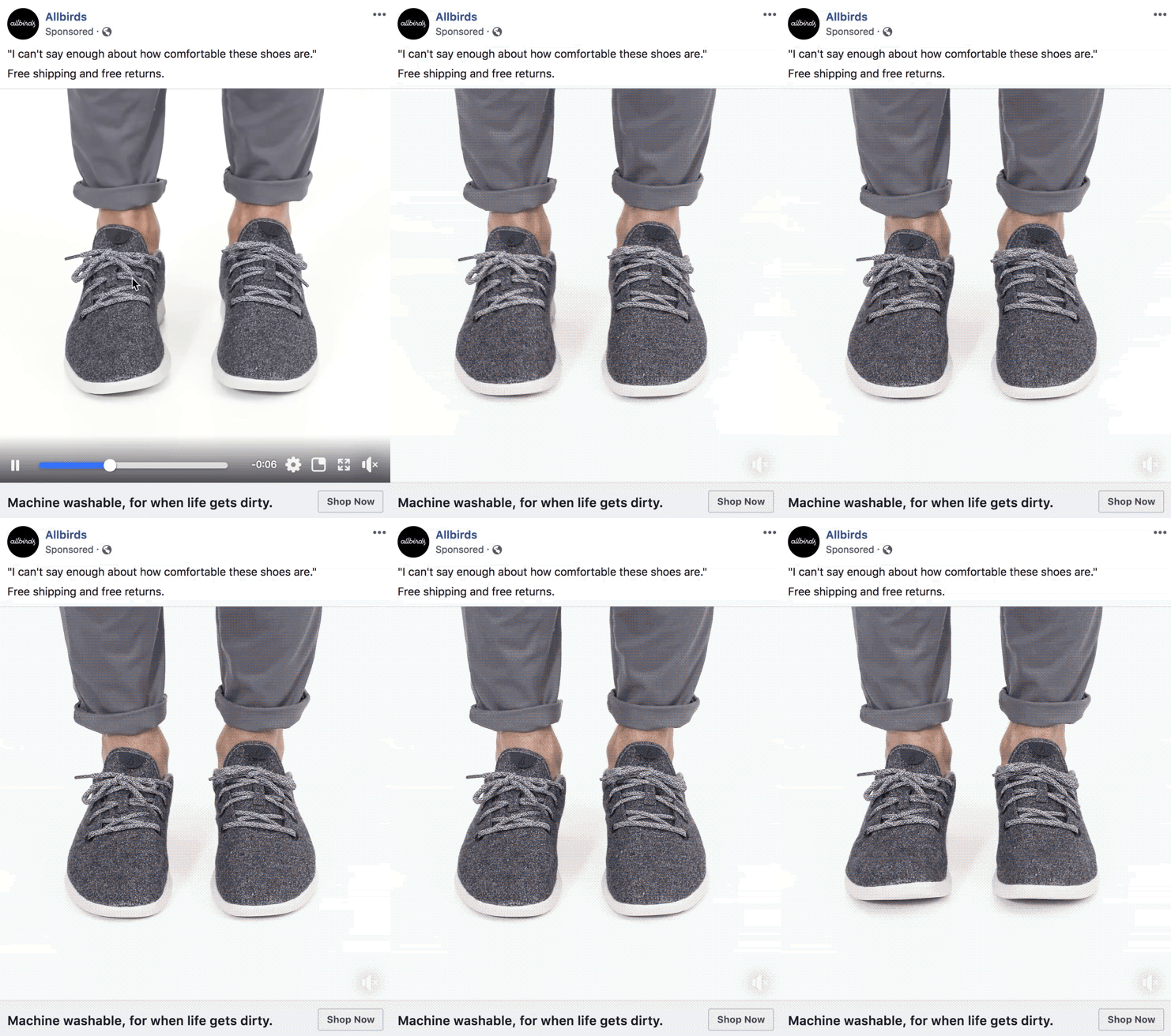
The video runs for just 9 seconds, but the product is demonstrated in such a way that it draws your attention and relates with the everyday shoe-wearer.
There are so many ads on Facebook and when users browse through their News Feeds, everything begins to blend together.
Hence, in order to stand out, you need to make use of subtle movements just like this video ad.
Even though other video ads on Facebook are flashy, this simplicity can be eye-catching to users.
Inspirations from this Ad:
- The video sticks to a clear objective, which is the comfort of the shoes. If you look closely, the movements in the video align to this objective.
- The power of incentives. Allbirds puts a crown on this ad by placing “free returns” and “free shipping” which helps lead to sales.
- Noticeable call-to-action. If you are interested, you can easily hit the “shop now” button to get them.
5. Bustle Boosted Post
This is a great example of a boosted post. Bustle proved that paying to boost a post update is highly beneficial if it has general appeal.
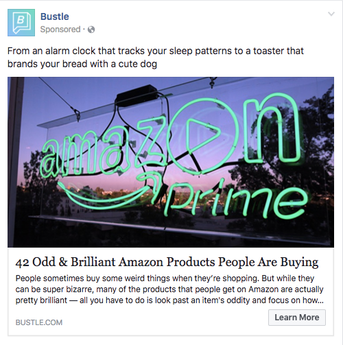
However, keep in mind that if your post targets only a segment of your audience, this ad type may not be the best for you, but Bustle used it to its advantage.
From the inescapable bright Amazon neon sign in the image to the numerous examples listed in the post, this boosted ad certainly peaks the interest of Bustle and Amazon followers.
Inspirations from this Ad:
- It’s unique. Amazon’s Prime logo is quite familiar to users, but not when in bright neon lights. This unique visual display catches the user’s eye because it’s something new.
- Strong descriptions. The word “brilliant” is very powerful to use in describing a product and that is just the effect Bustle creates with this boosted post. This ad makes the user curious and wanting to find out the reason why the word “brilliant” is used to describe the offer.
6. Heals Facebook Ad – “Get a Great Doctor to you”
Regardless of the awesome technological strides in medicine, having to go to see a doctor is still not anyone’s favorite thing to do. The driving to the appointment, the waiting…simple routine checkups can easily eat up your day.
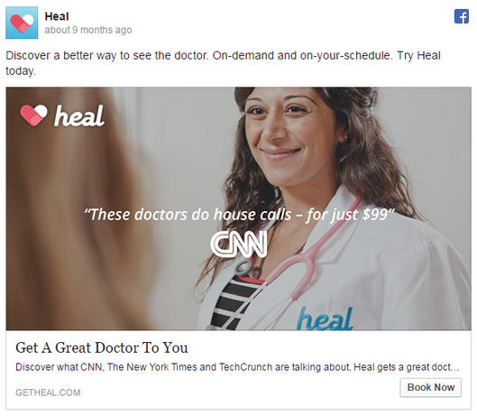
Therefore, the tech startup called Heal has the goal to refine the way we view our doctors.
The Heal app ad gets it right on every level by using very descriptive information. For example, the text just above the visual clearly describes what Heal is.
The image of the ad, on the other hand, is a mixture of a welcoming and approachable physician, invoking a feeling of trust with the user.
Even though the copy of the photo appears minimal, it cleverly used words such as “discover” to emanate a sense satisfaction from using the app.
Additionally, clearly stating how the Heal service works on-demand connects with the user’s expectation of quick service which is now the new norm with service-based brands.
Finally, regarding the text, it doesn’t just offer convenience through a house call doctor but emphasizes a “great” doctor.
It’s subtle but it’s a compelling word choice contributing to the success of the ad.
Inspirations from this ad:
- The pain of the user is the focus of the ad. By following this model, viewers of your ad see it as a solution to their problems.
- Using subtle but compelling words is highly effective in internalizing the information about your offer.
- Trust is essential. A simple image showing a friendly person related to your service or product is strong enough to build trust with your users.
7. Winc Facebook Retargeting Ad
This Winc retargeting ad is short and appealing. This is the right column ad type that specifically targets users who have previously browsed on wine.
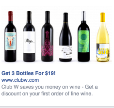
When your product is aimed at people who you know are already interested in your product, following the Winc ad model could be a home run for your business.
Inspirations from this Ad:
- Very simple visuals that appeal to wine lovers and will be sure to catch their attention.
- The value prop is enticing as it offers 3 bottles for just $19 as well as a first order discount. That’s powerful enough to convince any wine lover to make a purchase.
- The strong compelling word “get” is used twice in its CTA. The only thing missing is a limited time offer, which would have made this ad even more awesome.
Facebook Ads Best Practices
After seeing these 7 inspirational ad examples, it’s important to know some of the things that made these ads great models to follow:
1. Visuals
Visual content won’t just be given preferential treatment in the Facebook algorithm, but it would most likely be remembered and shared than plain text content. Regardless of the ad type, your image must be visually appealing.
2. Relevance
The relevance of your ad is vital for the success of your Facebook ad campaign.
You spend money every time someone clicks or views your ads so if your ads aren’t relevant to the audience seeing it, you might as well be flushing your money down the toilet.
3. Value Proposition
Value proposition informs the viewer why they should learn more about your offer, but it needs to be believable.
If for example you claim that your soda is the best, people may disagree with you. However, if you offer 20% off your soda then they might be more likely to try it.
4. Call-to-action
Regardless of how visually appealing or relevant your ad is, if you do not have a clear CTA, users will just be impressed and move on.
You need to add a clear CTA like “Save 30% on first order” to entice people to click on your ad.
Conclusion
Facebook ads with powerful targeting features are an excellent way to reach your desired audience. The examples above will help you do just that.
Remember, it isn’t what you offer but how you offer it that matters in getting quality conversions.
